
Most of the time, you need to know/navigate what the menu is available and the list of options/ features underneath.
Here’s the post just about the User Interface with screenshot on the Power BI Menu and a brief list of options under each. This will help anyone in the Pl-300 exam. Knowing is the beginning of Wisdom.
If you want to know the User Interface of the Power BI Service, then check this out!
Advantages of knowing the User Interface:
- Efficient Navigation: Understand where tools and features are located for quicker work.
- Effective Data Visualization: Use the interface to choose and customize visualizations to display data well.
- Data Modeling: Import, relate, and calculate data effectively using the interface.
- Report Creation and Design: Arrange visuals, format text, and add interactive elements to create engaging reports.
- Data Analysis and Exploration: Utilize features like filters and slicers to analyze and explore data thoroughly.
- Sharing and Collaboration: Learn to publish, refresh data, and manage permissions for sharing with others.
- Troubleshooting and Support: Use interface tools for diagnosing issues and seeking help when needed.
Let’s get started with Power BI Desktop now.
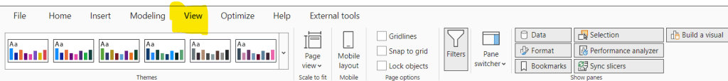
Opening Screen – User Interface of Power BI Desktop [REPORT VIEW]
1. The home page of the new report is as below. You will see
a) Report, Table, Model Tab on the left
b) Panes at the right
c) Menu bar at the top
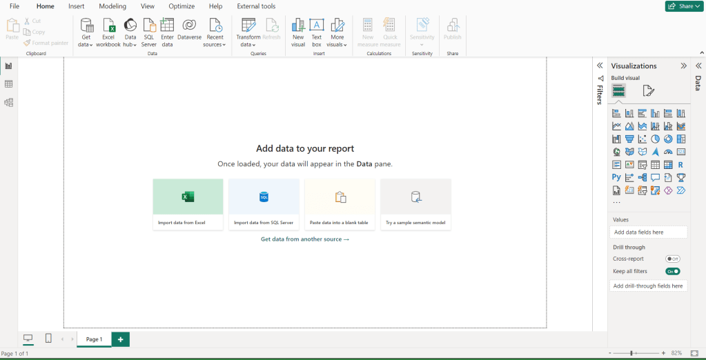
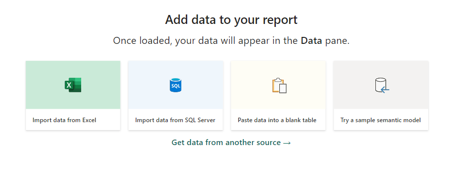
2. Four instant options to upload data to Power BI
- Import from excel.
- Import from SQL data
- Paste data into a blank table
- Try semantic model
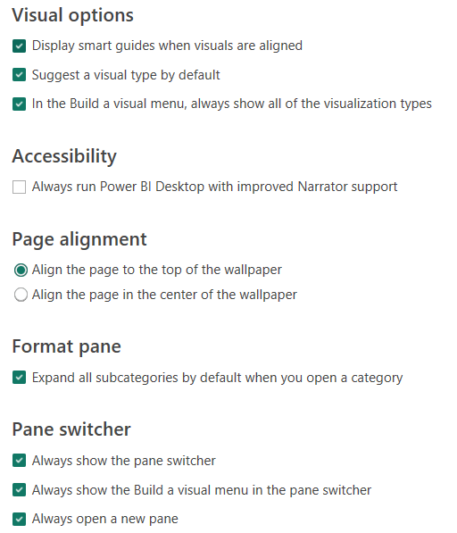
3.Recently, Power BI changed the look and feel of the Panes at the right. All the settings are available under Report Settings.
4. Customize the Pane Switcher:
Most recent update in Power BI Desktop is Pane Switcher under View Menu.
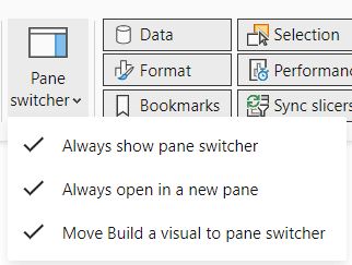
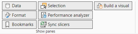
There are 4 out of 8 important panes where you spend most of your time in Power BI Desktop.
- Filter
- Format
- Build a Visual
- Data
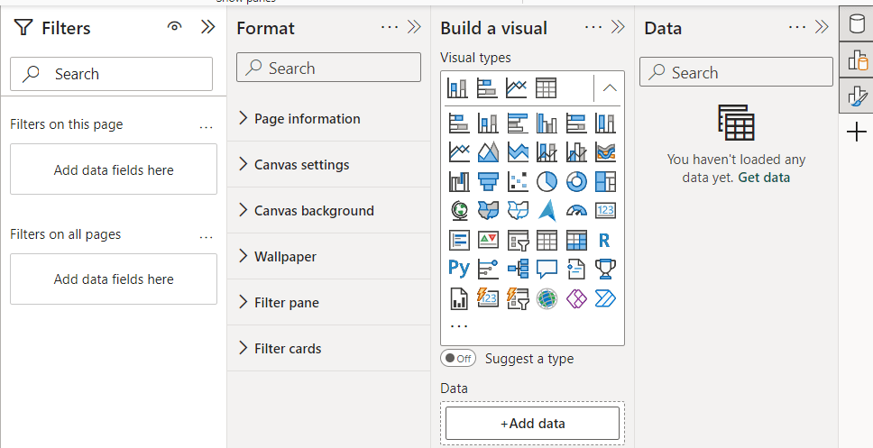
5. The other options available are below:
5. Bookmarks
6. Selection
7. Performance Analyzer
8. Sync Slicers
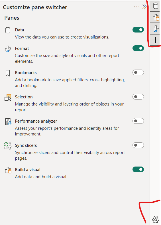
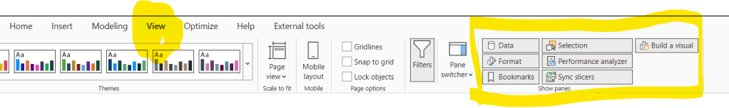
You can also control these views under View Menu
Home Menu in Power BI Desktop
Let’s get into the menu group options in the Home page.

- Clipboard:
- Contains basic clipboard operations like cut, copy, and paste for elements within the report canvas.
- Data:
- Provides options for managing data sources, such as importing data, connecting to different data sources, transforming data, and managing relationships between tables.
- Get Data
- Excel Workbook
- Onelake storage hub
- SQL Server
- Enter data
- Dataverse
- Recent sources
- Provides options for managing data sources, such as importing data, connecting to different data sources, transforming data, and managing relationships between tables.
- Queries:
- Offers tools for managing queries, including creating, editing, and managing queries used to transform data before it’s loaded into the data model.
- Insert:
- Allows users to insert various elements into the report canvas, such as visuals, text boxes, shapes, images, and buttons, to create compelling reports.
- All visual types
- Move visuals -> From File or From Appsource
- Text Box
- Allows users to insert various elements into the report canvas, such as visuals, text boxes, shapes, images, and buttons, to create compelling reports.
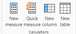
- Calculations:
- Contains tools for creating calculated columns, measures, and tables using DAX (Data Analysis Expressions) to perform calculations and add custom metrics to the data model.
- New Calculation
- New Measure
- Quick Measure
- Contains tools for creating calculated columns, measures, and tables using DAX (Data Analysis Expressions) to perform calculations and add custom metrics to the data model.
- Sensitivity:
- Provides options for configuring sensitivity labels to classify and protect data based on its sensitivity level, ensuring compliance with data protection regulations.
- If the sensitivity button is greyed out, it may indicate that you don’t have an appropriate license or that you don’t belong to a security group that has permissions to apply sensitivity labels, as described in Enable sensitivity labels in Power BI.
- Provides options for configuring sensitivity labels to classify and protect data based on its sensitivity level, ensuring compliance with data protection regulations.
- Share:
- Offers options for sharing the report with others, including publishing to the Power BI service, exporting to different file formats, printing, and accessing additional sharing options.
- Publish button – Think of the “Publish” button in Power BI Desktop like a magic portal. When you click it, it sends your cool reports and charts from your computer out into the world, so other people can see them.
- So, click that button and let your creations fly! 🚀✨
- Offers options for sharing the report with others, including publishing to the Power BI service, exporting to different file formats, printing, and accessing additional sharing options.
Insert Menu in Power BI Desktop
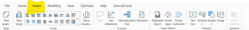
Next time you’re making a report in Power BI Desktop, check out the Insert menu. You’ll find lots of cool stuff there! From charts to AI magic, and even ways to connect to other tools.
Adding text, buttons, and pictures is easy too! There’s so much you can do with it. Give it a try and see the amazing things you can create!
Lets see what are the different groups available:
- Pages: Organize your report into different pages for better navigation. Options includes
- Create New Page
- Duplicate Page
- Visuals: Choose from various charts and graphs to visualize your data.
- More Visuals: Explore additional visualizations beyond the basic options provided.
- From my files
- From AppSource
- AI Visuals: Access advanced visualizations powered by artificial intelligence for deeper insights.
- Q&A
- Key Influencers
- Decomposition
- Smart Narrative
- Power Platform: Integrate your Power BI report with other Power Platform tools.
- Paginated Report
- Power Apps
- Power Automate
- Elements: Add text boxes, buttons, shapes, and images to enhance your report’s design.
- Sparklines: Incorporate sparklines to display trends or patterns within your data in a compact format.
Modelling Menu in Power BI Desktop
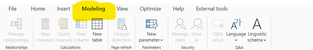
Lets see what are the differnt groups available:
- Relationships: Manage connections between different data tables to establish how they interact and relate to each other.
- Calculations: Create custom calculations and measures using DAX (Data Analysis Expressions) to derive insights from your data.
- Page Refresh: Control how often your data is updated in your report to ensure it reflects the latest information.
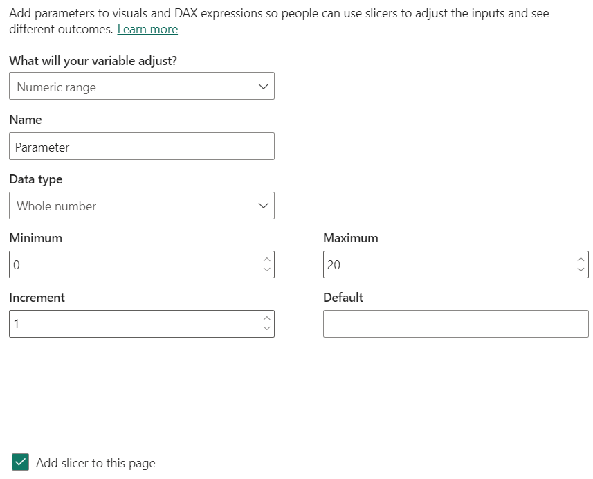
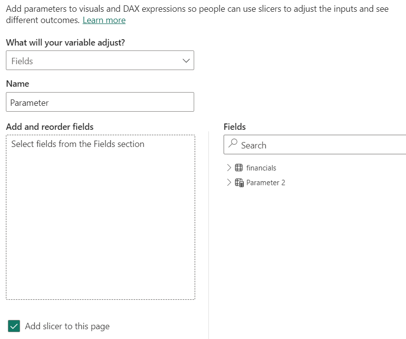
- Parameters: Define parameters to make your reports interactive, allowing users to filter and analyze data dynamically.
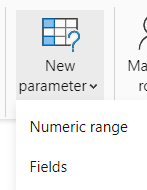
Numeric Range vs Fields:
Numeric Parameters: With this option, users can create parameters that accept numeric values. These parameters can be used in calculations, filters, or other parts of the report to make them dynamic and interactive.
Fields Parameters: This option enables users to create parameters that accept fields from their data model.
These parameters are useful for scenarios where users need to select a specific field dynamically, such as choosing which column to display in a visualization or applying dynamic filtering based on user selection.
For instance, you could create a fields parameter to allow users to select different categories to analyze sales data by product category dynamically.
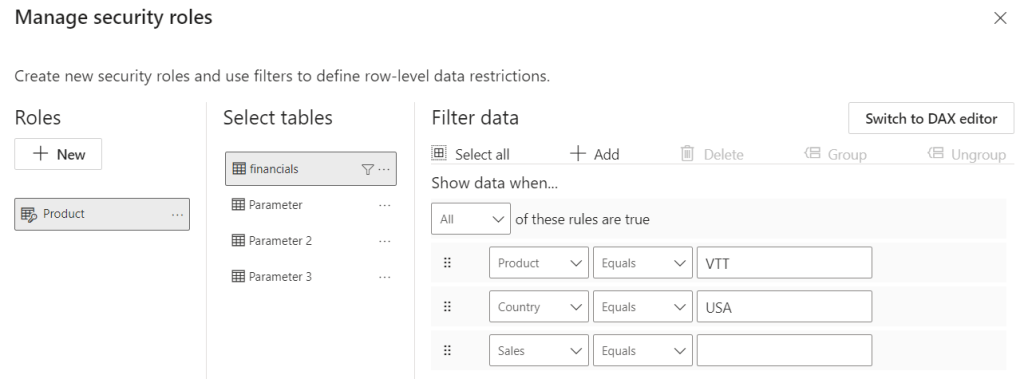
- Security: Implement security measures to control access to your data and reports, ensuring sensitive information remains protected. This is the key concept in Power BI – Row Level Security option is enabled here.
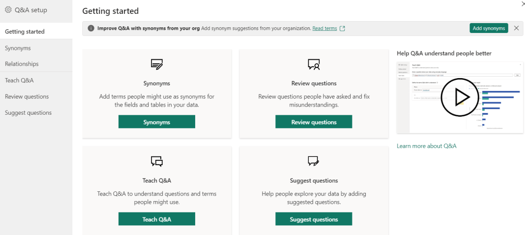
- Q&A Setup: Enable the Q&A feature to allow users to ask natural language questions and receive instant visualizations based on your data.
- Relationships: This section within the Modeling tab of Power BI Desktop allows you to define connections between tables in your data model. These connections establish how data points in one table relate to another, ensuring your data analysis is consistent and accurate.
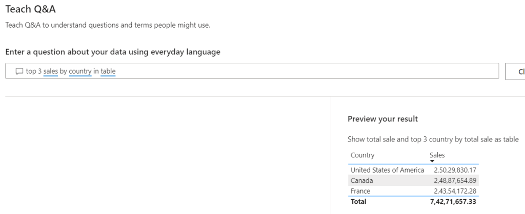
- Tech Q&A (Currently Unavailable): This option might be a placeholder or reserved for future functionality. Power BI Q&A currently focuses on natural language question asking through reports and dashboards, not within the Modeling tab.
- Review Questions: This section, accessible through the Q&A tooling (in preview), lets you review questions users have asked about your data model. You can see unrecognized words and gain insights into how users are interacting with your data.
- Suggest Questions (Preview): This section, part of the Q&A tooling, empowers you to suggest questions users can ask about your data model. By providing prompts and examples, you can guide users towards effective ways to explore your reports and dashboards.
View Menu in Power BI Desktop
- Themes: This group lets you change the overall visual style of your report. You can choose from pre-built themes or create custom ones, affecting elements like background color, fonts, and text formatting.
- Scale to fit: This group provides options to adjust the size of your report elements to fit the window. You can choose to fit the page width, page height, or both, ensuring all visuals are displayed clearly without excessive scrolling.
- Mobile Layout: This group allows you to create a separate view of your report page specifically optimized for viewing on mobile devices. You can use the mobile layout view to arrange and format visuals in a way that works best for smaller screens.
- Page options: There are three options – Lock Objects, Snap to Grid, Gridlines.
- View > Gridlines: Enables or disables gridlines on the report canvas, providing visual reference points when positioning visuals.
- View > Snap objects to grid: Enables or disables snapping visuals to the gridlines when you move them, ensuring consistent spacing and alignment.
- View > Gridlines: Enables or disables gridlines on the report canvas, providing visual reference points when positioning visuals.
- Show panes: This group controls which additional panes are visible in the Power BI interface. You can show or hide elements like the Filters pane, Formatting pane, and Fields pane, depending on your workflow needs.
Optimize Menu in Power BI Desktop
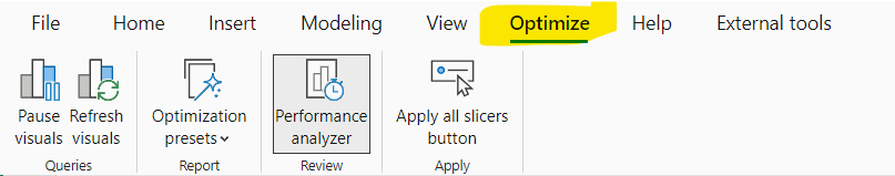
- Pause Visuals
- Refresh visuals
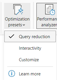
- Optimise Presets
4. Performance Analyser
The Performance Analyzer in Power BI Desktop is a powerful tool used to analyze and optimize the performance of your reports. Its primary function is to identify bottlenecks and inefficiencies in your report design and data model, helping you improve the overall performance and responsiveness of your Power BI projects.
Key features and uses of the Performance Analyzer include:
- Visual Rendering Time: It provides insights into how long it takes for each visual on your report canvas to render. This helps you identify visuals that may be taking too long to load and optimize them for better performance.
- Data Refresh Time: The Performance Analyzer allows you to track the time it takes for data to be refreshed in your report. This is particularly useful for reports connected to large or complex datasets, where data refresh times can impact user experience.
- Query Execution Time: It measures the time it takes for each query to execute against your data sources. This helps you identify slow-performing queries and optimize them by restructuring your data model or applying query folding techniques.
- Interaction Time: The Performance Analyzer tracks the time it takes for users to interact with your report, such as applying filters or slicers. This helps you understand how responsive your report is to user actions and optimize it for better interactivity.
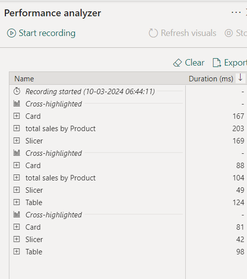
For each visual, it provides
- DAX Query:
- Analyzing the DAX queries helps identify any inefficient or complex calculations that may be impacting the performance of the visual.
- Visual Display:
- This section displays metrics related to the rendering of the visual on the report canvas. It includes information such as the time taken to render the visual, the number of data points displayed, and the overall rendering performance.
- Understanding the visual display metrics helps identify visuals that may be taking too long to load or render, allowing you to optimize them for better performance.
- Other:
- This category may include additional performance metrics or insights specific to the visual. It could encompass factors such as data source latency, network latency, or any other relevant performance-related information.
- Exploring the “Other” metrics provides a comprehensive view of the factors influencing the performance of the visual, enabling you to identify and address any performance bottlenecks effectively.
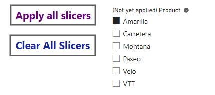
Apply All slicers:
The “Apply All Slicers” button in Power BI Desktop is a convenient feature that allows users to quickly apply selections made across all slicers in a report.
By clicking this button, users can ensure that their filter selections are applied uniformly throughout the entire report, providing a consistent and synchronized view of the data.
External Tools Menu in Power BI Desktop
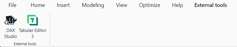
DAX Studio:
- Download and install DAX Studio from the official website: DAX Studio
- Once installed, open Power BI Desktop.
- In Power BI Desktop, go to the “External Tools” menu under the “Home” tab.
- Click on “DAX Studio” to launch the tool.
- In DAX Studio, you can write DAX queries, format DAX code, and perform various other tasks related to DAX development.
Tabular Editor:
- Download and install Tabular Editor from the official website: Tabular Editor
- Once installed, open Power BI Desktop.
- In Power BI Desktop, go to the “External Tools” menu under the “Home” tab.
- Click on “Tabular Editor” to launch the tool.
- In Tabular Editor, you can work with Tabular Model projects, including DAX code formatting and model management.
DAX Formatter:
- Open your web browser and navigate to the DAX Formatter website: DAX Formatter
- In the DAX Formatter editor, paste your DAX expression into the text area.
- Click on the “Format DAX” button.
- The DAX expression will be automatically formatted according to the DAX Formatter’s rules, making it easier to read and understand.
- You can then copy the formatted DAX expression and paste it back into Power BI Desktop or any other DAX editor you’re using.
While DAX Formatter is not directly integrated into Power BI Desktop, it’s a convenient online tool that you can use to format your DAX expressions quickly and efficiently.
By formatting your DAX code with DAX Formatter, you can improve its readability and maintainability, making it easier to debug and troubleshoot your Power BI projects.
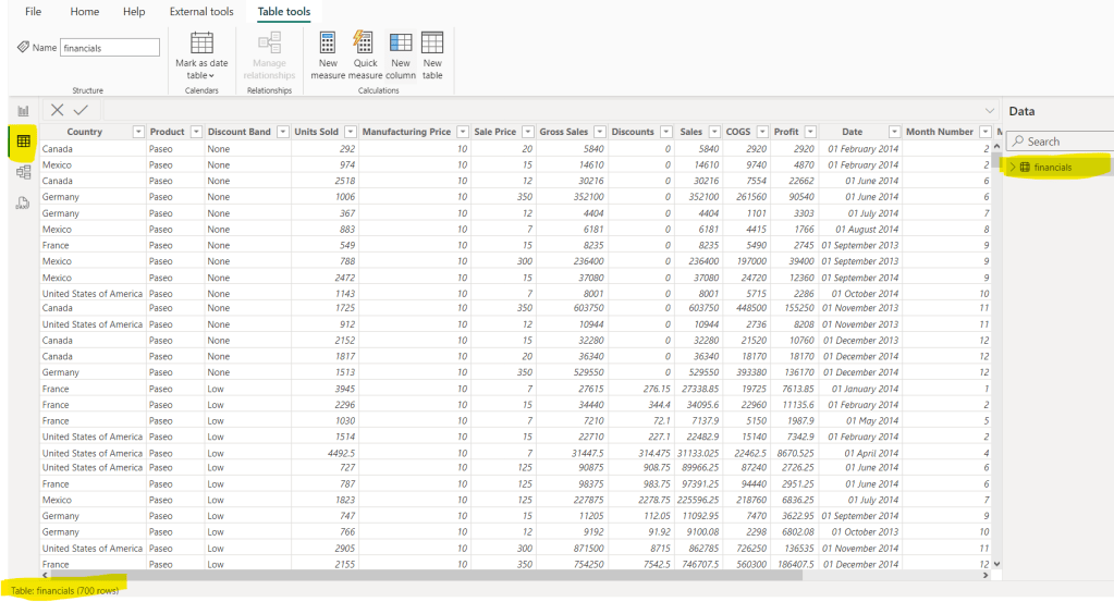
DATA VIEW IN POWER BI DESKTOP:
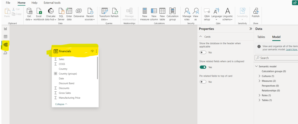
MODEL MENU IN POWER BI DESKTOP
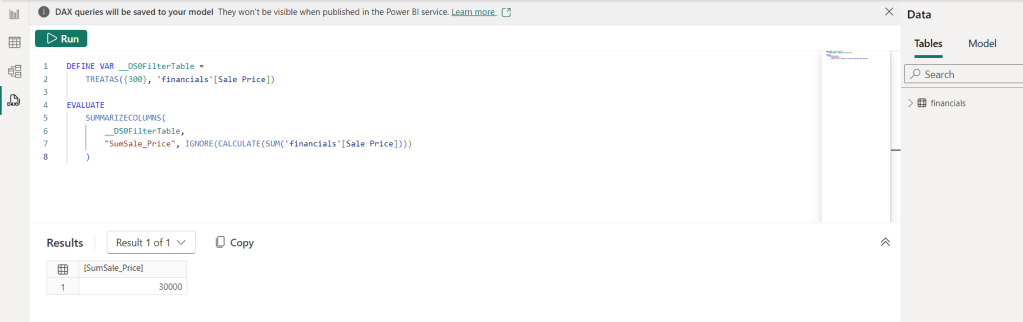
DAX QUERY VIEW IN POWER BI DESKTOP
Discover more from LR Virtual Classroom
Subscribe to get the latest posts sent to your email.
