Excel is the most commonly used tool for data storage, data analysis, accounting, budgeting, reporting, visualizations and the list goes on.
Pivot table is one of the key feature of the Excel and used to various activities like summarize, sort, reorganize, group, count, total or average data stored in the excel.
Irrespective of any industry, domain or role, Pivot Table is the bread and butter for the Excel usage.
25 Features & Functions of the Pivot Tables
Here’s the basic 25 Features & Functions of the Pivot Tables everyone should know. Lets get started.
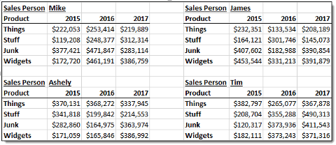
1. Two dimensional Matrix table: You can use pivot table to show the multiple row and column fields like below. Expand the data to show various levels & groups of data.
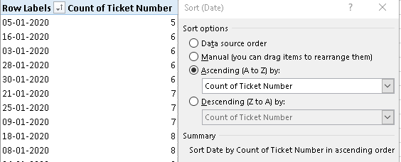
2. Make use of Sorting & Filtering features in Pivot table. They help you to quickly glance through the data.
3. Most important function to have multiple INBUILT Calculations ranging from basic to vital functions in Pivot Tables which will help you to automate the report and not do the manual calculation every time for the same data.
4. Pivot Table Layouts & Colors – Any pivot table should be kept very simple for easy understanding. There are three different types of Layouts.
5. Pivot Charts – You can directly visualize your data using pivot charts from your pivot table. That too with click of the button. The pivot charts will also recommend the suitable chart type based on the data in the pivot table.
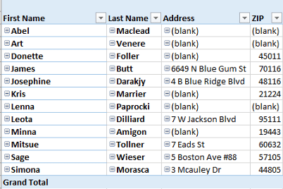
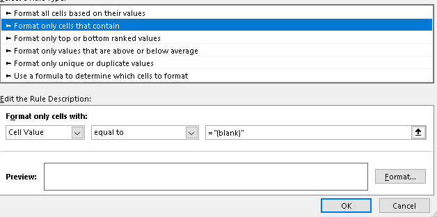
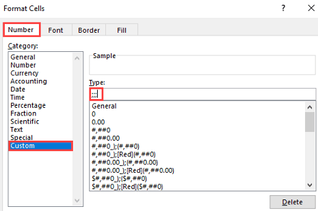
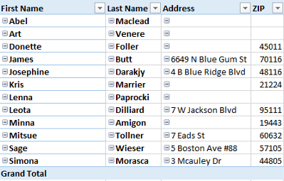
6. Remove blank fields from the pivot table – Most of the time, you have blank in the data fields. BUT by changing the format of the data using conditional formatting option – Select custom – ;;; . It will convert all the blanks into white spaces.
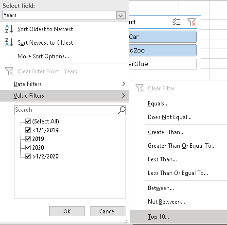
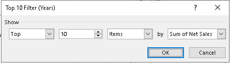
7. Filter TOP N items in Pivot table with just click of the button – How cool is it right?
8. Slicers – My most favorite option in pivot table. Interactive Pivot Chart with Slicers. It gives you immense option to filter one or more than pivot tables at the same time. You can find it under Insert-> Slicer. Slicer menu has different options. It makes your dashboard Interactive.

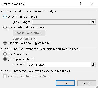
9. Work with multiple worksheets at the same time and extract the data for your pivot table. You have convert the data into table ( Shortcut – Ctrl+T). If you have applied a table on the data source, Excel won’t include that total while creating a pivot table.
The very important note is there should at least one common field between two tables to make meaningful analysis.
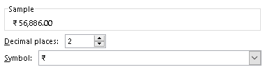
10. Change the number format for the pivot table fields – This is very handy function if you want to convert numbers to accounting values etc.
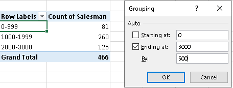
11. What if you want to Group your data and represent in simplified manner. Grouping Dates & Numbers is the one I’m talking about.
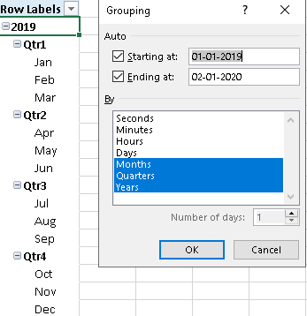
“Cannot group that selection” error message if appears. Don’t get worried. When the source data is added to the data model, you end up with an OLAP-based Power Pivot, instead of a traditional pivot table, and the grouping feature is not available. In OLAP-based pivot tables, you can create calculated field, calculated item etc.
- When you create a pivot table, there’s a check box to “Add this data to the Data Model”.
- If you checked that box, you won’t be able to group any items in the pivot table.
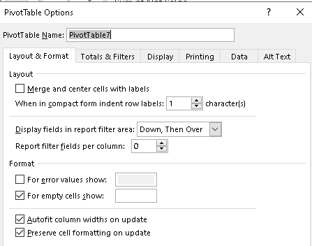
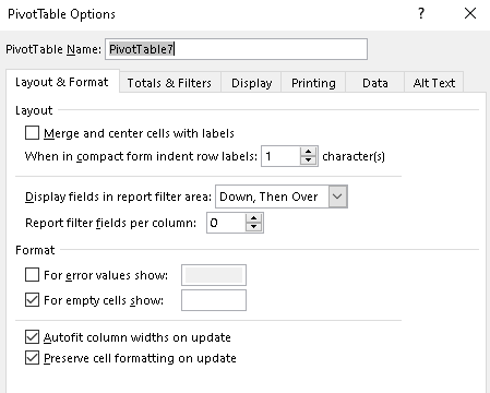
12. Preserve pivot table formatting – At times, after your pivot table refresh, you may lose the formatting. In order to retain, ensure you check the box as shown below in options. Right click -> Pivot Table options-> Preserve
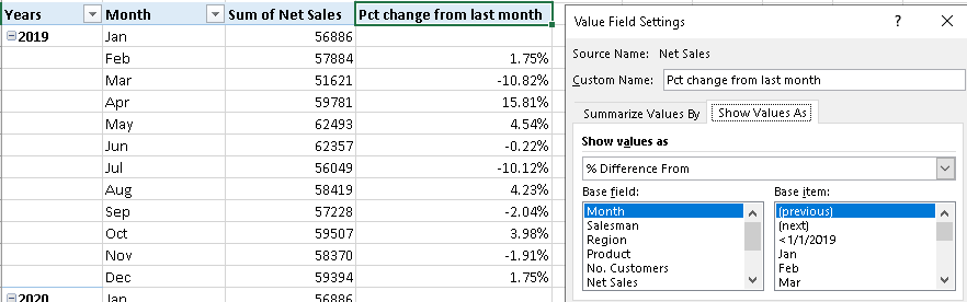
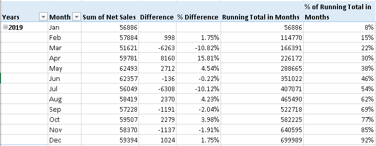
13. Find the % difference from the previous month, running total etc. calculations are very easy with Pivot table.
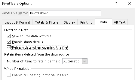
14. Disable pivot table width size – If you want the pivot table to autofit the columns widths, then check the box as below:
15. Auto refresh of the pivot table when opening the file – Easy but effective because sometimes, if you forget to manual click refresh pivot table then the data goes for a toss.
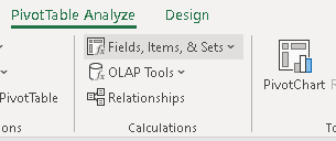
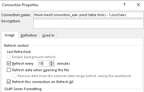
16. When using connections, schedule the refresh. In Analyze Tab, Data ➜ Change Data Source ➜ Connection Properties
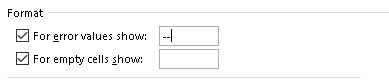
17. When you have error values in the pivot table calculations, you can modify them for the look and feel of the table as below under pivot table options.
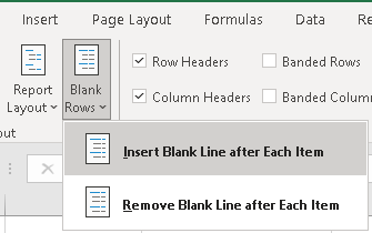
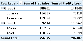
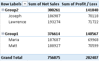
18. When you have congested pivot table, its very difficult to read between the line. So inserting the Blank line after each row to avoid messy look as shown below.
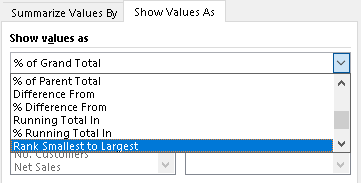
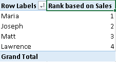
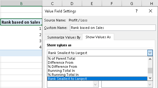
19. Ranking gives you a better way to compare things with each other…What if pivot table has the option to do quickly for huge sets of data.
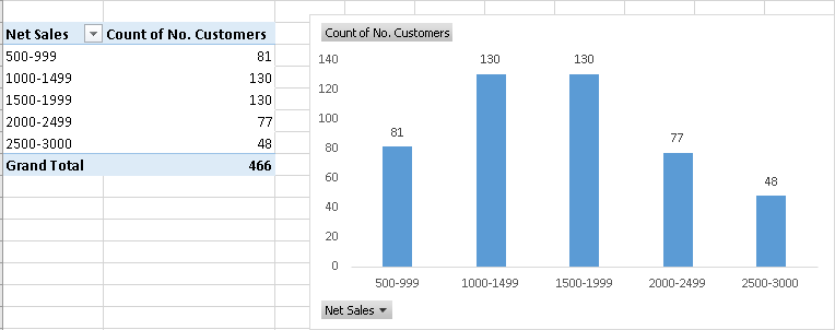
20. Creating Histogram chart is the very easy using pivot table and pivot chart options. You need to use Group selection option. Ensure, you are not using any data connections or “Add data to data model option is not enabled while creating pivot table.
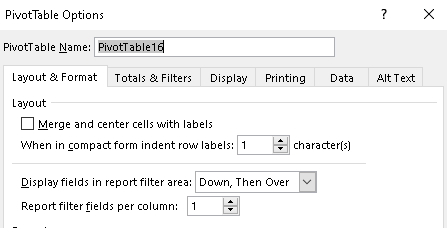
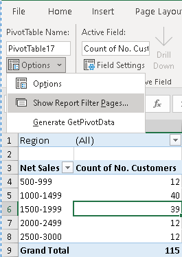
21. Generating Multiple Reports from One Pivot Table – This is just a cool feature if you know how to use them effectively. When you want to create multiple pivot tables for each filters, then ensure the “Report filters fields per column is 1.
Then under Pivot table analyze menu, click options-> Show report filter pages, Select the filter field for which you want multiple pages. Done! Excel produces multiple worksheets, one each for a report filter setting. The only thing to note is “it will need to have a field in the filter area”
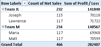
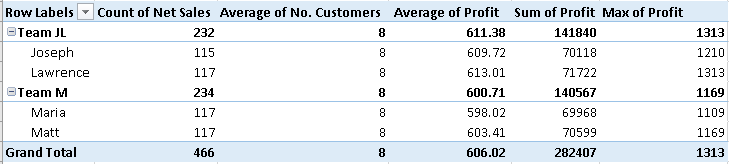
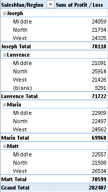
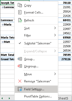
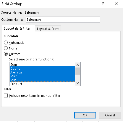
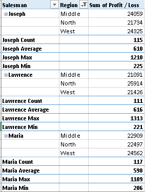
22. Add multiple calculation “Sum/count/max/min” to your pivot table – Usually pivot tables will show “subtotal” by default. But here, based on the field, you can add count, sum, Max, Min etc.
Right click on the field, select field settings.
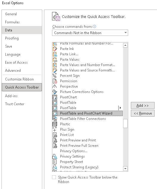
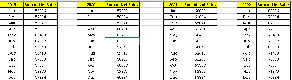
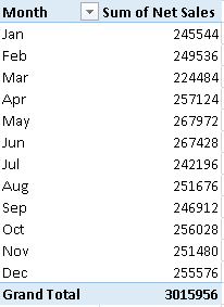
23. Unpivot to Pivot – Consolidate Multiple Sheets With The PivotTable Wizard. First enable the option “PivotTable and PivotChart Wizard.” You can access this by adding a command to the quick access toolbar for the wizard. It can be found under the Commands Not in the Ribbon section and it’s labeled PivotTable and PivotChart Wizard.
Then If you want to combine the below ranges into pivot table, open the “Pivot table & Pivot chart wizard”. Add all the ranges and click create.
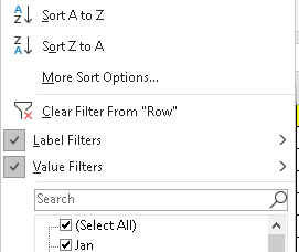
24. More Than One Filter on Pivot Table Field – Usually, Pivot table has only one filter that can be applied. If you want multiple filters to be used in same pivot table, under Pivot table analyze menu, click options.
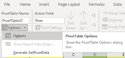
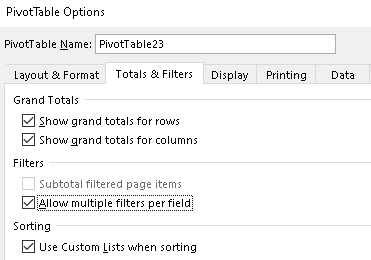
Both Label and Value filters can be applied now. How useful it is right 🙂
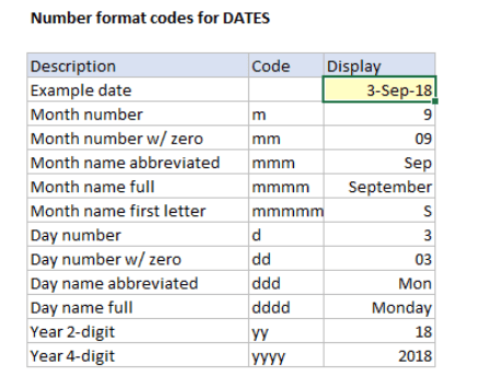
25. Pivot table custom code – The enormous way of representing the data format is one of the elegant feature of Pivot table. Here’s below:
| Number | Custom code | 213 | 1765 |
| Thousands | #0,”K” | 0 K | 2K |
| Thousands (Decimal) | #0.0,”K” | 0.2 K | 1.8 K |
| Number | Custom code | 342000121 | 435554321 |
| Millions | #0,, “M” | 342 M | 4356 M |
| Billions | #0,,, “B” | 0 B | 4 B |

| % of sales | Custom Code (▲ 0.0 %;▼ -0.0 %) |
| 0.5 | ▲ 50.0 % |
| 0.6 | ▲ 60.0 % |
| 0.7 | ▲ 70.0 % |
| -0.5 | ▼ -50.0 % |
| -0.9 | ▼ -90.0 % |
Happy Pivoting !!
Discover more from LR Virtual Classroom
Subscribe to get the latest posts sent to your email.
