
In the world of data crunching, Power BI is like a magician turning numbers into clear insights. But here’s a secret: colours are its magic wand. They make your data pop and help people understand it faster.
Imagine looking at a dashboard filled with charts and numbers. If the colours are all over the place, it’s like a messy painting—it’s hard to focus and understand what’s important.
But with the right colours, everything clicks. The data stands out, trends are easy to spot, and decisions become crystal clear.
In this blog post, we’ll dive into how to choose colours wisely for your Power BI dashboards. We’ll explore why colours matter, how they affect our brains, and practical tips to make your dashboards not just informative, but visually compelling.
Get ready to learn how to turn data into a story that everyone can understand at a glance.
Common Mistakes to Avoid with Colors
While colors can enhance your Power BI dashboards, using them improperly can lead to confusion. Here are a few common mistakes to watch out for:
- Overusing Colors: Too many different colors can overwhelm the user and make the dashboard feel chaotic. Stick to a limited palette.
- Lack of Contrast: Low contrast between text and background colors can make your reports difficult to read, especially for users with vision impairments.
- Inconsistent Color Usage: Using different shades of the same color for similar categories can confuse the viewer. For example, using both light blue and dark blue for data representing “Sales” and “Revenue” without a clear reason could create ambiguity.
- Colorblindness Considerations: Ensure that your color choices are accessible to users with color vision deficiencies. Use tools like ColorBrewer to help you select color schemes that work for everyone.
Key Microsoft Recommendations for Color in Power BI
To ensure your reports are both visually appealing and effective, Microsoft offers the following tips for using color in Power BI:
- Apply a Theme to the Entire Report
- Consistency is key when designing a dashboard. Using a single, cohesive theme across all visualizations ensures that your audience isn’t distracted by clashing colors.
- Power BI provides built-in themes, or you can create a custom theme that matches your company’s branding.
- Change the Color of a Single Data Point
- If you need to highlight a specific data point (e.g., the highest value in a chart or an important KPI), use a unique color for that data point to draw attention.
- Conditional Formatting
- Conditional formatting allows you to apply different colors based on data values. For example, you can color-code cells in a table based on their value, or apply a heatmap style to a chart.
- This makes it easy for users to quickly identify trends or anomalies in the data.
- Base the Colors of a Chart on a Numeric Value
- Use color gradients to represent a range of values. For example, lighter shades could represent lower values, while darker shades indicate higher values.
- Base the Color of Data Points on a Field Value
- Use a field’s value (such as “Region” or “Category”) to assign specific colors to data points, ensuring the chart is both informative and visually consistent.
- Customize Colors Used in the Color Scale
- Power BI allows you to customize the color scale to better represent your data. Choose a color gradient that suits your report’s context.
- Use Diverging Color Scales
- Diverging scales are particularly useful when you need to show two extremes (such as positive vs. negative values) and everything in between. The two colors should contrast well and clearly highlight the range.
- Add Color to Table Rows
- Adding alternating row colors or conditional formatting to table rows can make it easier to read large datasets by visually separating rows.
- How to Undo in Power BI
- If you accidentally make a change to your color settings, simply use the undo function (Ctrl + Z) to revert to the previous state.
- Keep Brand Consistency
- If you’re designing dashboards for a company or client, use brand colors whenever possible to maintain consistency and strengthen brand identity. You can either apply custom themes or select colors that are already part of the organization’s visual style guide.
- Matching the tone: Choose colors that align with the tone of your report (e.g., use a more muted, professional palette for business performance dashboards, or brighter, more engaging colors for marketing-related dashboards).
- Use Shades of a Single Color for Related Data – When you have related categories of data, use shades of a single color to represent them. This method helps reinforce the relationship between categories while maintaining color harmony.
Have you heard of Colour Wheel:
A color wheel is an essential tool in design. It helps you visualize how colors relate to one another and can guide you in creating harmonious color schemes. The color wheel divides colors into:
- Primary Colors: Red, Blue, and Yellow
- Secondary Colors: Green, Orange, and Violet
- Tertiary Colors: Yellow-Orange, Yellow-Green, Blue-Green, Blue-Violet, Red-Violet, Red-Orange
By understanding the relationships between these colors, you can create visually appealing and balanced Power BI dashboards.

Choosing Status Colors for Your Dashboard
Different colors can communicate different statuses within your data. Here are some commonly used color associations for Power BI dashboards:
- Red (#E0301E):
- Meaning: Critical issues, errors, or alerts that need immediate attention.
- Use Case: Highlighting failed processes, severe deviations, or error messages.
- Yellow (#FFB600):
- Meaning: Warnings or items that require caution.
- Use Case: Indicating items that are pending or require further review.
- Green (#175C2C):
- Meaning: Success, completion, or positive outcomes.
- Use Case: Showing tasks that are completed, targets achieved, or growth.
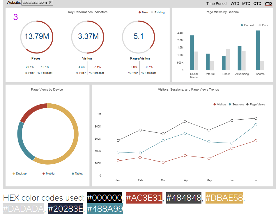
Primary Colors used in one of the BiG 4 Consulting company
Here’s an example of a color palette used by a major consulting firm that provides a balance of bold and professional tones:
- #D04A02: Burnt Orange
- #EB8C00: Amber
- #FFB600: Amber (a similar shade)
- #DB536A: Coral Pink
- #E0301E: Bright Red
- #464646: Charcoal Gray
- #000000: Black
- #7D7D7D: Medium Gray
- #D93954: Strong Pink
This palette combines both warm and neutral tones, ensuring a dynamic yet professional look for business reports.
Microsoft Power BI Pallette – Suggestions:
Power BI also offers a variety of pre-built color palettes that you can customize. Some common suggestions for creating visually appealing reports include:
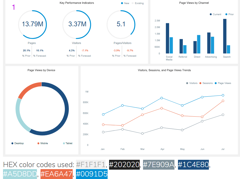
- Use contrasting colors: Pairing light and dark colors can help define data categories clearly.
- Avoid overusing red and green: While these colors are often used for positive/negative indicators, they may not be the best choice for everyone. For colorblind users, use additional markers or text to differentiate positive and negative trends.
- Soft color gradients: Gradients can help visually indicate trends over time, from low to high.
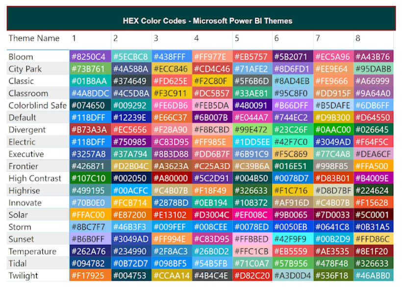
For more color palettes, explore this wonderful blog post with helpful hex codes for Power BI: Excel Kingdom – Color Palettes for Power BI.
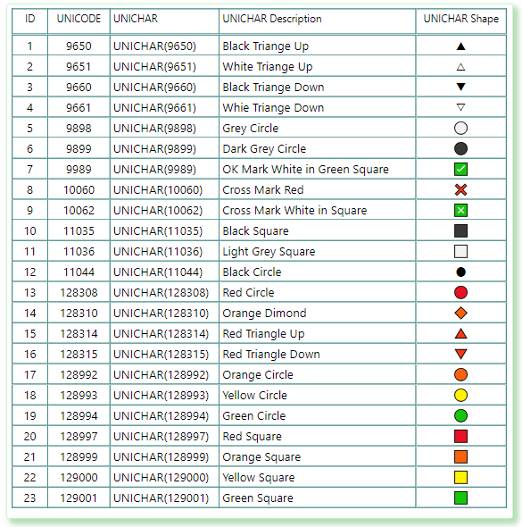
Unichar Codes for Presentations & Dashboards:
List of popular UNICODE / UNICHAR Symbols (only for reference):
Useful References:
Below are some useful websites where you can find color palettes:
1. Colorhexa (My favorite)
2. Coolors
3. Colormind
4. Paletton
5. Mycolorspace
6. Canva
Below are some useful websites where you can upload images to pick colors:
1. Coolors
2. Canva
3. Imagecolorpicker
4. Hexcolor
- More color combinations: Canva Design School
- Sample dashboard layouts: Sketch Repo
- Design captivating enterprise dashboards using a style guide
Colour Palettes for Business Presentations:
I like this website as it gives a simple dashboard to visualise the HEX Codes.
Conclusion
In my experience, the right colors can make or break a dashboard. I’ve seen reports go from cluttered and confusing to crisp and insightful—just by tweaking the color scheme.
The key is to use colors with purpose: guiding the viewer’s eye, highlighting what matters, and making data easy to digest. So, as you design your Power BI dashboards, think of colors as your secret weapon.
Keep it simple, stay consistent, and most importantly, make sure your visuals tell a clear and compelling story.
Happy designing!
Discover more from LR Virtual Classroom
Subscribe to get the latest posts sent to your email.
