Key pointers from the MS Learning path for PL-300
Build Power BI visuals and reports
1. Goals while desiging the reports
- Audiences
- Report type
- User interface requirements
- User experience requirements
2. An analyst is a person who provides guidance to the organization. Analysts can be responsible for a range of tasks, often with goals of determining the effectiveness of business strategies, developing or improving processes, or implementing change.
3. An information worker is someone who uses data to help make decisions or take actions. Often, these decisions and actions are operational in that they are done on a daily basis. The inventory manager at the Contoso Skateboard Store, who needs up-to-date information about stock levels, is an example of an information worker audience.
4. An executive is a person who is charged with making plans and decisions that often involve a medium or long-term focus. Executives are responsible for making the business run smoothly. For example, the C-level executives at the Contoso Skateboard Store would be an executive audience.
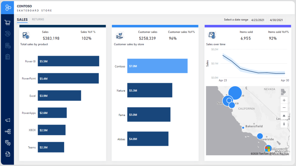
5. Four report types: 1) Dashboard 2) Analytical 3) Operational 4) Educational
6. The primary goal of a dashboard is to interpret the story as quickly as possible. User interactions are limited by insights that are highly curated toward the audience. Report visuals are focused, self-explanatory, and clearly labeled.
7. Dashboard is a report that allows users to view several analytics values, targets, statuses, and trends.
8. Analytical reports often have many slicers to filter report data, and they often contain complex visuals that expose in-depth detail of the data. Eg: sales analysis report that allows drilling into sales revenue from year, down to quarter, month, and day.
9. Operational reports serve as a hub for action that is used by report consumers as part of their daily activity and workload. A streamlined user experience is the primary aim for this report type because excessive clicking or illogical flow can lead to high dissatisfaction. Eg: inventory report that informs the report consumer of current stock levels, and highlighting low stock levels or back orders. It also includes a Submit Order button that allows users to create a purchase order.
10. Educational reports assume that the report consumer is unfamiliar with the data or context. So the reports must provide clear narrative detail and guidance to help with understanding.
This type of report is often used in journalism and by governments to disseminate information to large audiences that have varying levels of understanding of the subject. Eg: describes the rollout of COVID-19 vaccination progress and that can be filtered by the home geographic region of the report consumer.
11. UI requirements relate to how reports are consumed and to the appearance and behavior of reports. Aspects to consider include form factor, input method, style and theme, and accessibility.
12. Form factor describes the size of the hardware that is used to open reports, and to page orientation (portrait or landscape). Mobile devices, which are typically used when the report consumer is away from their desk, have a smaller form factor. Phones and tablets display content in portrait orientation by default
13. Input Method – number of visuals that display together on the page, the complexity of visuals, spacing between visuals, and the use of interactive design elements such as tooltips, slicers, buttons, or filters.
14. Style and theme – At a minimum, the theme should include the following elements:
- A brand mark or logo symbol.
- A palette of colors that align to, or complement, organizational branding. The colors should also be sufficiently different so that, when applied to visuals, they provide appropriate contrast when appearing side by side.
- Text settings, including font selection, sizes, and color.
15. Accessibility – Adding alt text to visuals for screen reader support, and setting tab order for keyboard navigation. To support people with low or no vision, consider using:
- clear and large-sized fonts,
- well-spaced and large visuals,
- sufficiently contrasting colors,
- and intuitive report navigation that can be understood by keyboard and screen readers.
16. UX – Support for interactions, such as:
- Drill up, drill down, or drill through to details.
- Navigation within the report or to other reports.
- Filters or slicers that can be applied to report visuals, specific pages, or all pages.
- Data export as specific data formats, such as Microsoft Excel or a comma-separated value (CSV) file.
- Support for ad hoc questions to retrieve a response in the form of a data visualization.
- Configuring of data alerts to notify people when specific data values change or exceed predefined thresholds.
- Links to open webpages.
- Actions to open applications, write back data entry values, or trigger workflows.
- What-if analysis that allows the report consumer to modify “what-if” values to understand the consequences of different scenarios. For example, what-if analysis could allow consumers to predict sales revenue based on different consumer demand estimates.
- Page layouts that can extend over multiple pages and are suitable for printing as multi-page documents.
- Printing the report to a physical printer or as a PDF document.
- Subscribing to the report so that it can be automatically delivered as a document on a scheduled basis.
- Adding commentary, feedback, or engaging in a conversation about the report.
17. Power BI Desktop is only supported on Windows operating systems.
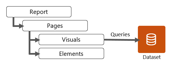
18. Report objects include:
- Visuals – Visualizations of semantic model data.
- Elements – Provide visual interest but don’t use semantic model data. Elements include text boxes, buttons, shapes, and images.
19. You can configure various page-level settings, which can be set in the Format options. Commonly applied settings include page information, page size, and page background.
20. Report design is a blend of science and art, and many possible report designs are available that help achieve the audience and interface requirements. What matters most is that the report design effectively communicates the data to meet requirements.
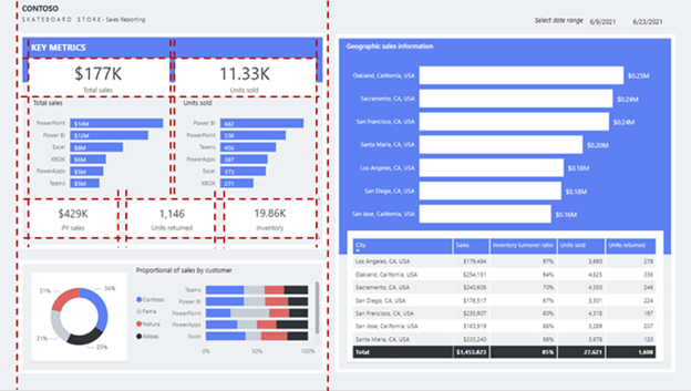
21. Good placement of report objects contributes to an ordered report design. Generally, you should place the most important information in the upper-left corner of the page and arrange the report elements from left to right and top to bottom
22. Consider applying the rule of thirds, which is a visual arts rule that can be applied to report object placements in an analytical report. The rule proposes that a page layout should be divided into an invisible grid of nine equal parts. The grid is formed by two equally spaced horizontal lines and two equally spaced vertical lines. Then, report objects can be placed within the cells of the grid
23. Balance is concerned with stability and structure in design. In the context of a report layout, balance refers to the weight that is distributed across the report page by the placement of objects of the same or different sizes.
24. Balance can be symmetrical or asymmetrical. Symmetrical balance is achieved by distributing the weight evenly on both halves of the page. Asymmetrical balance is achieved through contrast.
25. Consider using the golden ratio as a guide to produce asymmetrical balance. The ratio is based on the Fibonacci Sequence, where two quantities are in the golden ratio if their ratio is the same as the ratio of their sum to the larger of the two quantities.
26. If applied to report design, the golden ratio will align a page to have one large visual to draw initial attention, which is then supported by smaller visuals that provide context.
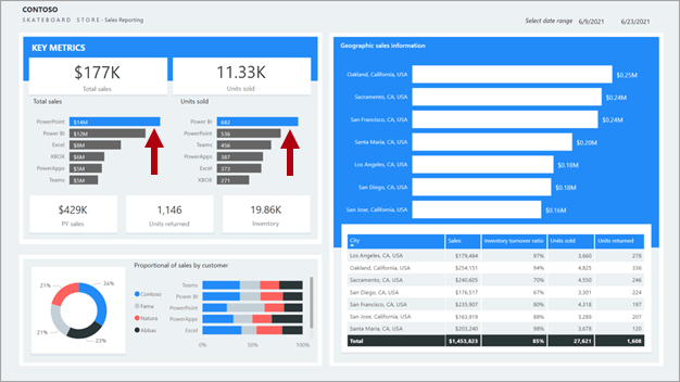
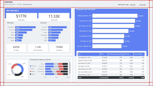
27. In a report layout, proximity is concerned with the nearness of report objects. When a report page consists of multiple groups of related objects, you should use space to visually separate them. In the following report design, notice the top-left section labeled key metrics. Related visuals are placed near one another. They are also purposefully and consistently aligned forming a clear section.
28. good report design layouts should consider design principles of placement, balance, contrast, proximity, and repetition.
29. Contrast can be used to combine two opposing objects. The use of contrasting colors, fonts, font properties, or lines can emphasize important objects of the report design. Use this principle to direct report consumers to where they should look or which data visual they should interact with first.
30. Repetition in a report design creates association and consistency. Good use of repetition can help strengthen a report layout by tying related report objects together.

31. Space is essential for an effective report design because it helps reduce clutter and increase readability. Spacing applies to the report page margins and the spacing between report objects.
32. Margins include the border area, or edge, around each page. Having a consistently spaced border area frames the report objects.
Because there isn’t a report page property to set margins, it’s up to you to lay out objects in way that results in a consistent border area. Margin sizes should be equal on the left and right, with possible variation on the top and bottom. Space across the top or bottom can show branding, titles, slicers, or other information that needs to be separated from the visuals.
33. When visual headers are enabled, be sure to test that they don’t overlap with nearby objects because overlapping objects can make interacting with visual header icons difficult. Appropriate spacing between visuals will help you avoid this problem.
34. You can set the page size to predefined or custom dimensions. Additionally, you can set custom dimensions that are larger than the available screen size so that the report consumer will need to interact with scrollbars to view the entire page.
35.However, a large page size that is filled with visuals might take time to render, and visuals might not render in a top-to-bottom order.
36. Generally, the more important the visual, the larger its size. Report consumers will quickly focus on larger visuals. When similar visuals are on the page, such as a series of card visuals, they should be equally sized.
37. When multiple visuals are on the report page, ensure that they’re properly aligned, meaning that the edges of visuals should be in alignment and the spacings between visuals are consistent.
38. Use color sparingly and meaningfully because overusing it can be distracting. Stick to a few softer colors as a base, possibly aligned with corporate colors. Softer colors ensure that the data is the focus in your report. Reserve the use of bolder colors to highlight exceptions
39. The colors that are applied on the left side of the page are different from those that are applied on the right side. Also, the colors are bright and can possibly distract the report consumer. Some colors, such as yellow, don’t provide sufficient contrast with the white data labels.
40. Be aware that the theme will be overridden when you explicitly configure a format option. For example, you can explicitly set a color by entering a HEX value instead of selecting a color from the palette. Try to limit overriding the report theme to an exception basis because if you switch themes, overridden properties won’t update.
41. Be sure to export the report theme, which is a JSON file, and then apply it to other reports to ensure consistency across all reports.
42. You can use an external site like powerbi.tips to generate a theme. The site will guide you through building a color palette and setting property values for all core visual types.
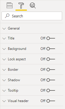
43. All report objects have some properties in common, which can be set in various sections of the Format options. Commonly applied settings include general properties (location, size, and alt text), title, background, border, and shadow.
44. Custom visuals format is .pbviz file whereas report is .pbix file. Custom visuals are sourced from Microsoft AppSource (an app store for business applications such as Microsoft Office 365, Microsoft Dynamics 365, Power BI, or separate Microsoft Azure web apps) or uploaded as a .pbviz file.
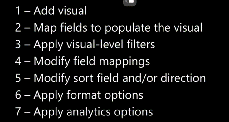
45. You can use the following general methodology to add and configure a visual:
- Select the visual type in the Visualizations pane and then position and size it on the page.
- Map semantic model fields to populate the visual. Each visual has one or more wells. The number and type of wells differ between visuals. Some visuals, like the slicer, have a single well, but others have many more.
- Optionally, apply visual-level filters. filtering, grouping, and summarizing data.
- Modify field mappings, possibly renaming fields, modifying summarization behavior (or restricting summarization), or enabling the Show items with no data option.
- Optionally, modify the sort field and the sort direction (in ascending or descending order).
- Optionally, apply format options to produce the desired result and style.
- Optionally (and when supported), use the Analytics options to overlay supporting data, like minimum or maximum lines, or Artificial Intelligence (AI) results like anomaly detection and forecasts.
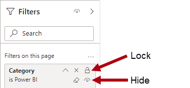
46. How to configure a visual as below steps
47. The four types of elements are:
- Text box – Add rich text, such as the title, to the report page. You can selectively apply font type and font size and then set the color, styling (bold, italics, or underline), and paragraph alignment (right, center, or left). You can insert hyperlinks, too.
- Buttons – Add buttons so that report consumers can interact with the report as they would an app. Buttons can perform different actions, such as return to the previous page, navigate to a specific page, drill through to a page, select a bookmark, open Q&A, or open a web URL in the default web browser.
- Shapes – Add a shape to the report as decoration or to behave like a button to perform an action. Almost any conceivable shape is possible, from basic shapes to arrows and even hearts. Shapes can include text and can be formatted and styled in many different ways.
- Image – Upload an image, such as your company logo, to the report page. Supported image types include BMP, JPEG, GIF, TIFF, and PNG. Similar to the Shapes element, images can behave like buttons to perform an action.
48. The text box deserves a special mention because it’s capable of embedding dynamic values that are sourced from the report semantic model into paragraphs of text. When the page is filtered, dynamic values are filtered. Technically, the text box isn’t a visual. However, in this instance, it behaves like one. It’s also available as the smart narrative visual, which automatically summarizes data by using text descriptions and insights.
49. Categorical visuals – bar or column charts are good choices when you need to show data across multiple categories.
50. You should sort by category when an established sequence is in place, such as steps in a process that should be displayed in that order in bar or column chart. But in line chart, it wont reflect correctly.
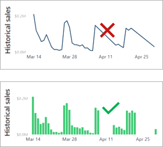
51. Time series visuals – Always use a line or column chart to show values over time. The X-axis should present time, sorted from earliest to latest periods (left to right).
52. Line charts work well with a consistent flow of data, such as when sales are recorded for every period. If no sales are recorded for some periods, the line chart visual will fill such gaps with a straight line that connects the values of the previous and next periods. If missing values are a possibility, a column chart might be a better visual choice because it will help to avoid the interpretation of a non-existent trend.
53. Other Power BI core visuals that you can use for time series data include
- Stacked column chart
- Area chart
- Line and stacked column chart
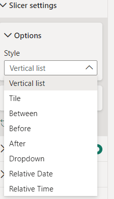
- Ribbon chart, which has the added benefit of showing rank changes over time
54. Proportional visuals – Proportional visuals show data as part of a whole. They effectively communicate how a value is distributed across a dimension. Column and bar chart visuals work well for visualizing proportions across multiple dimensions.
55. Other Power BI core visuals that you can use for proportional visualization include:
- 100% Stacked Column chart
- Funnel chart
- Treemap
- Pie chart
- Doughnut chart
56. Numeric visuals – Card and Multi card visuals are examples of Numeric visuals.
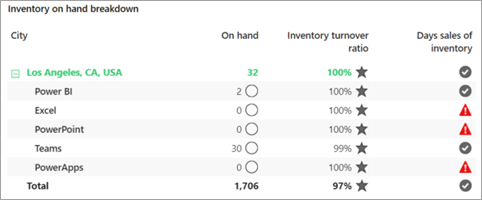
57. Grid visuals – Often overlooked, tables and matrices can effectively convey a lot of detailed information. Tables have a fixed number of columns, and each column can express grouped or summarized data. Matrices can have groups on columns and rows. Adding conditional formatting options, such as background colors, font colors, or icons, can enhance values with visual indicators.
58. Performance visuals – KPI visual is the perfect example. Any difference between the value and target is its variance, which can be favorable or unfavorable. Color or icons can convey status. For example, when the variance is unfavorable, you can display a red color or an exclamation mark (!) icon.
59. Other Power BI core visuals that you can use to show performance include:
- Gauge
- KPI
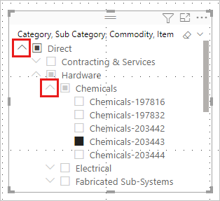
- Table, with conditional formatting
- Matrix, with conditional formatting
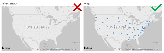
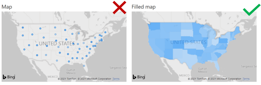
60. Geospatial visuals - Map, Filled Maps, Arcs visual. sales by city are displayed by using a Map visual and a Filled map visual. In this instance, the granularity of the data is at the city level and the perspective is the entire United States. Because a high dispersion is between plot points, the Map visual (which shows a bubble for each city) produces a helpful result. The Filled map visual of the United States can’t sufficiently convey city sales
61. Granularity to city level vs to State level – If you raise the granularity to state level, the Filled map visual will produce a better result than the Map visual.
62. A map visual can occupy considerable space on the report page. Also, geospatial data doesn’t always need to be shown in maps. If location isn’t highly relevant to the requirements, consider using a categorical visual instead.
63. the 100% Stacked Bar chart visual helps make it easier for you to determine relative values. The reason is because the visuals occupy a wide yet short area: The lengths of the long bars are easier to interpret than the heights of the short columns.
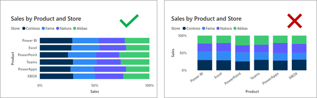
64. This situation isn’t always the case. When the visual needs to fill a narrow yet tall space, the 100% Stacked Column chart is more effective. The heights of the tall columns are easier to interpret than the lengths of the short bars.This situation isn’t always the case. When the visual needs to fill a narrow yet tall space, the 100% Stacked Column chart is more effective. The heights of the tall columns are easier to interpret than the lengths of the short bars.
65. Common formatting options include the Title, Background, and Border. In the Title section, you can add a title to the visual, if it does not have one, or edit the title, if it has one already. The aim of the title is to clearly describe what data is being presented in the visual. You can format the title by changing the text, text size, font, color, background, and alignment.
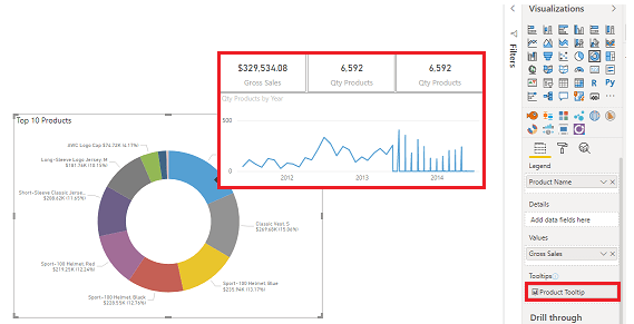
66. The Tooltips section allows you to add a customized tooltip that appears when you hover over the visual, based on report pages that you create in Power BI Desktop. Tooltips is a great feature because it provides more contextual information and detail to data points on a visual.
67. The default tooltip displays the data point’s value and category, but your custom tooltips can include visuals, images, and any other collection of items that you create in the report page.
68. However, you should not add many more fields to the tooltips because adding too many fields can introduce performance issues and slow down your visuals.
69. How to display the tooltip as a graph – Below is the step-by-step process.
1) create a new report and page size as Tooltip.
2) Page information section – Enable the Tooltip option.
3) on the View tab, set the Page view option to Actual size.
4) add one or more visuals to the tooltip page, in the same way that you would on any other report page.
5) Select a visual and then, in the Format pane, scroll down to the Tooltip section. Turn the tooltip option On and then select your tooltip page from the Page list.
70. To use a KPI, you need three pieces of information:
- INDICATOR – A unit of measurement that you want to track, for instance total sales, number of employee hires, number of loans serviced, or number of students enrolled.
- TARGET GOALS – A goal for the measurement so that you can compare your progress with that goal.
- TREND AXIS – A time series, for instance daily, monthly, or yearly.
71. Filtering can occur at five different levels of a Microsoft Power BI report:
- semantic model (RLS)
- Report
- Page
- Visual
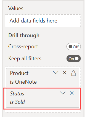
- Measure
72. When you filter RLS-filtered tables, take care to avoid situations where some report consumers see no data (BLANK) in the report. For example, consider a model that enforces RLS to restrict data visibility to specific countries/regions. If at design time, you have permission to see Australian data and you filter the report by Australia, a report consumer that has permission to see only United States data won’t see data at all.
73. A measure is a model object that is designed to summarize data. Measure formulas, which are written in Data Analysis Expressions (DAX), can modify filter context by using the CALCULATE or CALCULATETABLE functions. These functions are powerful and provide you with the flexibility to add, remove, or modify filters. A set of DAX functions, known as time intelligence functions, also modify filter context. These functions can override any filters that are applied to the report structure.
74. The Filters on all pages section defines report-level filters, which apply to all report pages and visuals. Report-level filters are global filters.
75. The Filters on this page section defines page-level filters, which apply to all visuals on a specific page, adding to any existing report-level filters. For example, if a report-level filter restricts data to the country of United States, and a page-level filter restricts data to the state of Washington, then both filters are in effect: Country is United States and State-Province is Washington.
76. The Filters on this visual section define visual-level filters. This section is only visible when one visual is in focus because visual-level filters apply only to a single visual; they add to any existing report-level and page-level filters. Extending the previous example, if a visual-level filter restricts data to the city of Seattle, then three filters are in effect: Country is United States, State-Province is Washington, and City is Seattle.
77. Filters apply to a single field and use one of the following filter types:
- Basic
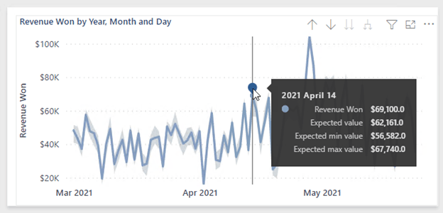
- Advanced
- Top N
- Relative date and Relative time
78. The Advanced filter type allows you to create more complex conditions by using data type-specific operators:
- Text field operators – Test for conditions such as “contains,” “starts with,” “is blank,” “is empty,” and others.
- Numeric field operators – Test for conditions such as “is less than,” “is less than or equal to,” and others.
- Date field operators – Test for conditions such as “is after,” “is on or after,” and others.
79. You can combine multiple tests by using a logical AND/OR operator.
80. The Top N filter type applies to text and date fields that are available only in visual-level filters
81. The Relative date and Relative time filter types apply to date fields only, making it possible to filter by relative date or time. Relative filters allow the report consumer to filter by past, present, or future time periods based on the current date and time.
82. Unlock filters – You can lock filters to ensure that report consumers can’t remove or modify them. It’s a good idea to lock filters that are critical to the design of the report, page, or visual.
83. Unhide filters – A hidden filter isn’t visible to report consumers. Consider hiding a filter when the report consumer doesn’t need to know about it, such as when filters are cleaning up the data, perhaps by removing BLANKs.
84. Steps to keep in mind while working with filters –
- Add and remove fields to filter.
- Change the filter state.
- Format and customize the Filters pane so that it appears like part of your report.
- Define whether the Filters pane is open or collapsed by default when a consumer opens the report.
- Hide the entire Filters pane or specific filters that you don’t want report consumers to see.
- Control and even bookmark the visibility, open, and collapsed state of the Filters pane.
- Lock filters that you don’t want consumers to edit.
85. Hide the Filters pane in Reading mode. If you don’t want your report readers to see the Filters pane, select the eye icon next to Filters. This is applicable in Power BI Desktop.
86. In the report, you can format the filter with below options.
- Background color
- Background transparency
- Border on or off
- Border color
- Title and header font, color, and text size
87. The default sort order for filters is alphabetical.
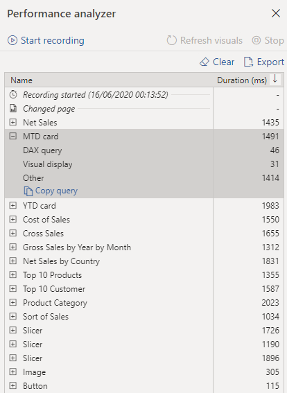
88. When you’re editing the Filters pane, you can double-click the title to edit it. Renaming is useful if you want to update the filter card to make more sense for your end users. Renaming the filter card doesn’t rename the display name of the field in the fields list. Renaming the filter card just changes the display name used in the filter card.
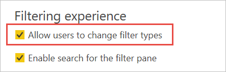
89. In Power BI desktop, While the Filters pane search feature is on by default, you can also choose to turn it on or off by selecting Enable search for Filters pane in the Report settings of the Options dialog.
90. Under the Filtering experience section of Report settings, you can control if users can change the filter type.
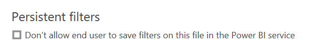
91. Also in Report settings of the Options dialog, under Persistent filters, select Don’t allow end users to save filters on this file in the Power BI service
92. Turn on the APPLY Button – Slicer, filter and cross-filtering
93. Important to note – Publish-to-web doesn’t display the Filters pane. If you’re planning to publish a report to the web, consider adding slicers for filtering instead.
94. The slicer is a core visual with one purpose: filter other visuals. By default, slicers filter all other visuals on the page. However, you can edit visual interactions to restrict filtering between two visuals.
95. To change the slicer style, select Format your visual > Slicer settings > Visual > Options > Style.
96.The slicer layout is responsive to the data type of the field. Field data types are either text, numeric, or date. By default, a text field will produce a list slicer, a numeric field will produce a numeric range “between” filter, and a date field will produce a date range “between” filter, allowing value selection with calendar controls.
97. Possible layouts for the field data type are:
- Text field – List (default) or dropdown
- Numeric field – List, dropdown, between (default), less than or equal to, or greater than or equal to
- Date field – List, dropdown, between (default), before, after, relative date, or relative time
98. Relative Filter – A slicer that is based on a date field offers additional layouts to filter by relative date or time. Relative filters allow the report consumer to filter by past, present, or future time periods based on the current date and time. For example, a relative date slicer could filter by the current date (today).
99. By using the sync slicers feature, a slicer selection on any page will affect visualizations on all selected pages. In Power BI Desktop on the View ribbon, select Sync slicers. The Sync slicers pane appears between the Filters and Visualizations panes.T
100. Two columns – Sync column and visible column – If you sync a slicer to a page but don’t make it visible on that page, slicer selections made on the other pages still filter the data on the page.
101. The sync slicers feature only supports one field at a time. If your slicer has more than one field (Category or Measure), the sync slicers feature is disabled.
102. Slicer list items are sorted in ascending order, by default. To reverse the sort order to descending, select the ellipsis (…) in the top right corner of the slicer > Sort axis > Sort descending.
103. Responsive layout is only available for tile slicers and numeric range slicers, not for vertical list slicers
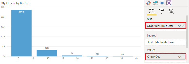
104. The Show “Select all” option is Off by default. Under Selection, turn Show “Select all” option to On to add a Select all item to the slicer. With it, you can select or deselect all items as once. When all items are selected, selecting one item deselects it, allowing an is-not type of filter.
105. Single select is Off by default. Selecting an item selects it. When you hold down the Ctrl key, you can select multiple items. Selecting an item again deselects it.
106. Create a relative date slicer and filter in Power BI –
- Last
- Next
- This
107. Select the slicer, and in the Format pane, under Visual > Slicer settings > Options, change the Style to Relative Date.
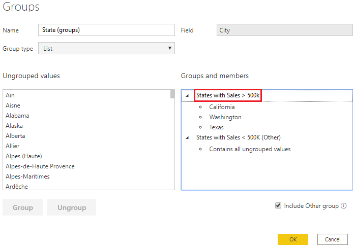
108. The data type for the field in the slicer must be a date, and not the default of text. Otherwise, the relative options don’t show up in the slicer.
109. The slicer and filter are always based on the time in UTC. If you set up a filter in a report and send it to a colleague in a different time zone, you both see the same data. Unless you are in the UTC time zone, you and your colleague must account for the time offset that you experience.
110. Dropdown options in Slicer for date field is as below
111. Add multiple fields to a hierarchy slicer -When you add multiple fields to the slicer, by default it displays an arrow, or chevron next to the items that can be expanded to show the items in the next level.
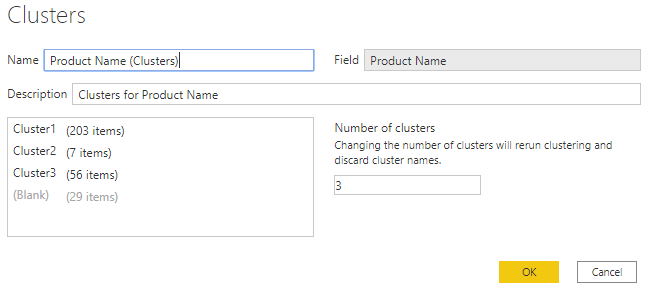
112. It might be tempting to think that slicers apply page-level filters because that’s the default result. However, it’s important to understand that a slicer is a visual that propagates filters to other visuals on the same page or (when synced) across other pages.
113. Beyond filters and slicers, report authors can employ other filtering techniques, such as:
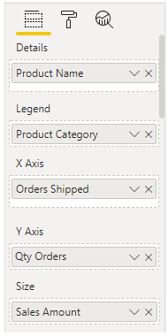
- Visual interactions – For example, a report consumer can select a column of a column chart visual to filter other visuals on the page. To remove the cross filters, they can either select the column again or select a different visual.
- Drillthrough – Add drillthrough pages to allow report consumers to drill from visuals. By default, the drillthrough action propagates all filters that apply to the visual to the drillthrough page.
- Report tooltip- Add report tooltips that will appear when report consumers hover the cursor over visuals. By default, the report tooltip receives all filters that apply to the visual.
- Bookmarks-Bookmarks capture a specific view of a report, including filters, slicers, the page selection, and the state of visuals. Report authors and report consumers can create them.
- Report options –
- Disable persistent filters. (Persistent filters are covered in Unit 5.)
- Hide visual headers for all visuals or for a specific visual. When the visual header is hidden, report consumers can’t hover the cursor over the Filter icon to determine the filters that are applied to the visual. (The Filter icon is covered in Unit 5.)
- Hide the Filter icon for a specific visual.
- Restrict report consumers from changing filter types (for example, basic to advanced) in the Filters pane.
- Remove the search box in the Filters pane.
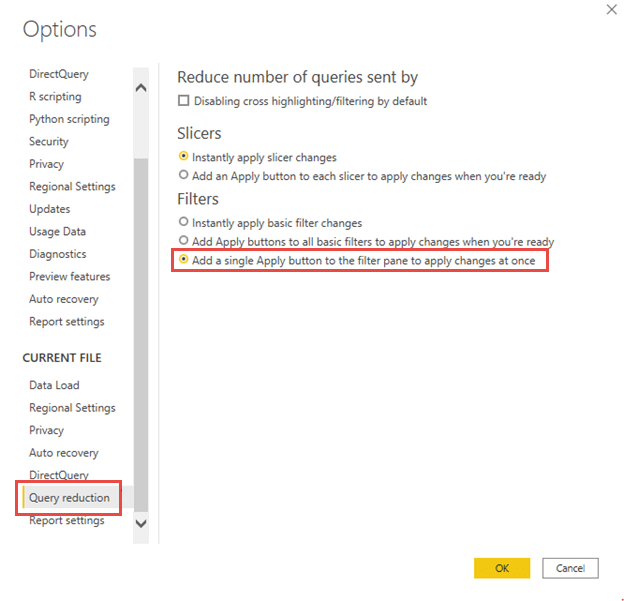
- Query reduction options- Report authors can configure report settings to reduce the number of queries that are sent to the semantic model. Fewer queries will result in better responsiveness as report consumers update filters or slicers or cross filter report pages.
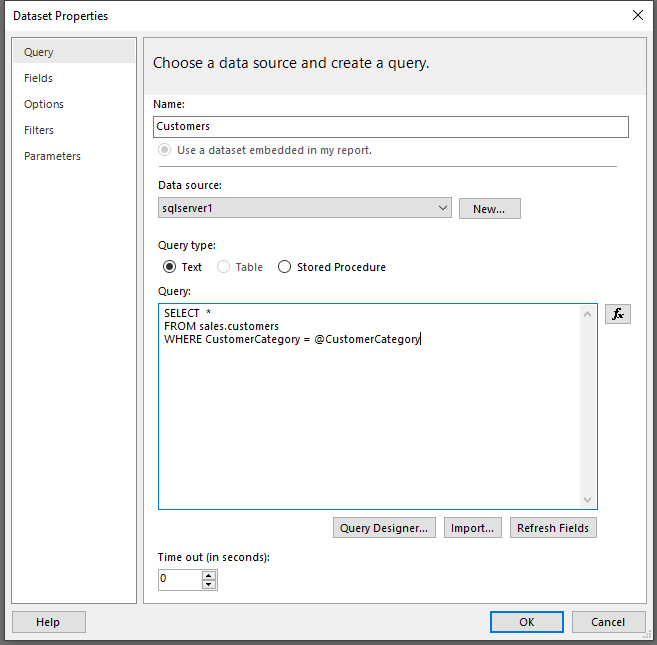
114. Set tooltip automatically based on the fields or manually by selecting the tooltip as page under Formatting – > General -> Tooltip enable.
115. To set a tooltip manually, select the visual for which you want to specify the manual tooltip, then in the Visualizations pane, select the Format section and expand the Tooltips card.
116. Consider enabling the query reduction options when the semantic model uses DirectQuery table storage or when imported data volumes are large and calculations are complex and slow.
117. Report settings can:
- Disable cross-highlighting/filtering by default. All visuals, except for slicers, don’t propagate filters to other visuals unless they are explicitly added as a visual interaction.
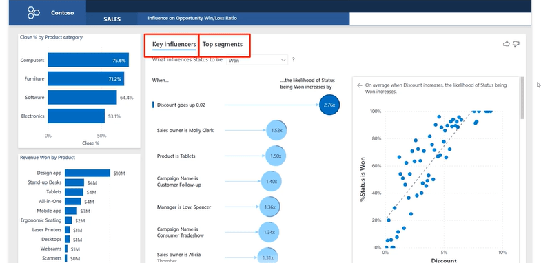
- Add an Apply button to the slicers. The slicer selection will only filter the report page when the report consumer selects the Apply button.
- Add an Apply button to all basic filters in the Filters pane. A single filter will apply when the report consumer selects the Apply button in the filter card.
- Add an Apply button to the Filters pane. All filters will apply simultaneously when the report consumer selects the Apply button. This option is helpful when report consumers want to update many filters at the same time.
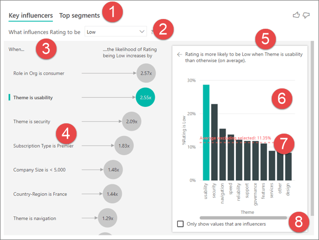
118. Equally as important is understanding what report consumers can’t do, such as:
- Add new filters.
- Remove filters.
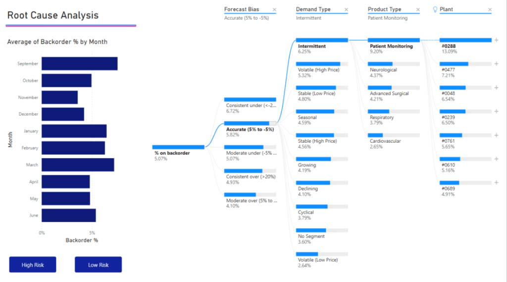
- Change the filter type to Top N, or relative date or time (for date/time fields).
- Enforce or disable single selection.
119. Typically, the decision to use a filter or slicer is a tradeoff between performance and design. Consider that the Filters pane will perform better (because Power BI doesn’t need to render slicer visuals), and it doesn’t take up space on the report page. However, you should also consider that slicers have the formatting flexibility to seamlessly integrate into the report page, creating the most refined experience possible for report consumption
120. Advantages:
- The Filters pane is consistently located on the right side of the report.
- It allows you to configure advanced filter types, like Top N, or allows you to use more complex expressions, like “contains,” “does not contain,” “is blank,” and others.
- The search box and sort functions (to order filters within the sections) are powerful tools to use when many filters exist.
- Filters result in faster report rendering because no visual rendering is required.
- You can lock and/or hide filters.
- When the Apply button is enabled, you can submit all filter updates at once, resulting in fewer queries.
- You can filter by using measures (only at the visual level).
121. Disadvantages:
- The Filters pane offers less design flexibility, though you can style it by using specific fonts and colors.
- Careful consideration should be made to hide certain filters to avoid confusing report consumers.
- It can be easy to lose track of applied visual-level filters.
122. The advantages and disadvantages that are associated with using slicers are as follows:
- Advantages:
- You can place slicers anywhere on the report page to produce an intuitive layout.
- Slicers are highly configurable to achieve the required functionality and style.
- You can configure hierarchical slicers (based on a hierarchy or by using multiple fields that are sourced from the same table).
- They can display their selection (filter context) directly on the report page.
- They can display images when you are using a field that is categorized as an image URL. For more information, see Specify data categories in Power BI Desktop.
- They can filter only certain visuals by editing visual interactions.
- You can filter slicers as you would any visual. For example, you can apply a filter to a slicer to remove the BLANK item.
- You can sort slicer items.
- Synced slicers can filter other pages in the report.
- Disadvantages:
- Slicers can have an impact on report render performance due to the visual render time.
- They occupy space on the page that could be used for data visuals.
- Slicer filtering options are less complex than the advanced filter options that are possible in the Filters pane. For example, you can’t configure a Top N slicer.
123. Visual level header icons – Below is the list of options available.
- Visual information
- Visual warning
- Visual error
- Drill on dropdown
- Drill up
- Drill down
- Show next level
- Expand to next level
- Pin
- Focus mode
- See data layout
- More options
- Filter
- Help Tooltip
- Smart narrative
124. Tips to help you produce successful report designs include:
- Use either filters or slicers. Avoid using both filter techniques because it can create confusion.
- In the Filters pane, consider locking or hiding visual-level filters to avoid confusing report consumers. (Often, report consumer shouldn’t modify or see visual-level filters.)
- Create a bookmark to reset all slicers to default values. Then, add a button to the page to invoke the bookmark. For example, the button could be captioned as Reset slicers.
- When a requirement is in place to lay out many slicers, consider creating a page that is dedicated to showing all slicers. For example, the page could be named Slicers. Sync the slicers to other pages and then set the slicers as hidden on those pages. This design technique will require that report consumers should always go to the Slicers page to modify slicer settings. To help them, you can add a page navigation button at a consistent location on each page so that they can easily return to the Slicers page.
- Consider using other visuals in place of slicers. Be sure to teach report consumers how to cross-filter by using these visuals.
125. Take care not to use horizontal orientation when many distinct values are present. Often, report consumers don’t notice the scroll arrows that allow navigation to the following items. Consequently, they might think that the value they’re looking for doesn’t exist.
126. The guided analytical experience allows navigation between three levels:
- High-level metrics
- Supporting visuals
- Details, when required
127. You can show details by using four different techniques:
- Use drillable visuals
- Add tooltips
- Add drill-through
- Embed paginated reports
128. The simplest way to show details is to use drillable visuals. The matrix visual is an excellent choice because it allows drilling on rows and/or columns. Therefore, by assigning hierarchies or multiple fields, report consumers can drill to the level of detail that they want.
129. Adding tooltips is a simple way to reveal details or provide supporting metrics. In Power BI service, tooltips appear when the report consumer hovers the cursor over an element of a report object. An element could be a column of a column chart or a bubble or region in a map. In a mobile app, tooltips appear when consumers are using the tap-and-hold gesture.
130. Page tooltips allow your report consumers to gain deeper insights quickly and efficiently from visuals. As its name suggests, a page tooltip is a report page that receives the filter context of the source element. In this way, they are closely related to drillthrough pages, with the difference being that the page tooltip overlays a small page of visuals.
131. Two ways to set up Tooltips
- Visuals – On a visual-by-visual basis, you can configure which visuals will reveal your page tooltip. For each visual, you can have the visual reveal no tooltip, default to the visual tooltips (which is configured in the visual Fields pane), or use a specific page tooltip.
- Visual headers – You can configure specific visuals to display a page tooltip. Your report users can reveal the page tooltip when they hover the cursor over the visual header icon. Make sure that you educate your users about this icon.
132. Page tooltips don’t support interactivity. If you want your report consumers to interact with the visuals, create a drillthrough page instead.
133. Drillthrough will navigate the report consumer to a different page, possibly in a different report, and it can show details. The main benefit of drillthrough is that you don’t need to clutter a report page with details. Instead, the details are available when required.
134.The Drillthrough flow is below – A common use case for drillthrough is to allow report consumers to achieve the following flow:
- View a report page.
- Identify a visual element to analyze in depth.
- Right-click the visual element to drill through.
- Perform complimentary analysis.
- Return to the source report page.
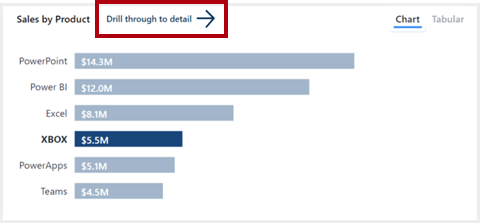
135. Report consumers might not be aware that drillthrough is supported by a visual. To promote visibility, you can add a button that performs drillthrough.
136. Other ways to use drill through.
- Create a button that drills through to details when they click it.
- Set up cross-report drillthrough to jump from one report to another in the same Power BI service workspace or app.
137. To keep all applied filters, go to the destination page. In the Drillthrough section of the Visualizations pane, set Keep all filters to On.
138. Add a measure to drillthrough – you can also add a measure or a summarized numeric column to the drillthrough area. Drag the drillthrough field to the Drillthrough card on the drillthrough target page to apply it.
139. Embed paginated reports – Use the Paginated report visual to embed a Power BI paginated report in your report. Paginated reports can connect directly to source databases, providing you with the ability to present transaction-level detail that’s not stored in the Power BI semantic model.
140. unlike the 150,000-row limitation that is imposed by Power BI reports, paginated reports can export up to 10,00,000 rows to Excel while retaining all formatting of the paginated report.
141. In the visual format options, you can enable the toolbar so that report consumers can use the export command. This command can export the paginated report in many different formats, including Microsoft Excel, PDF, Accessible PDF, CSV, PowerPoint, Microsoft Word, MHTML, and XML.
142. Highlighting values in reports helps you to quickly communicate important and relevant facts about data. Power BI supports several techniques to highlight values:
- Conditional formatting
- Overlaid analytics
- Anomaly detection
- Specialized visuals
143. You can use conditional formatting to format table and matrix visuals. With this approach, you can apply rules to highlight specific cells by using:
- Background color
- Font color
- Data bars
- Icons
144. Overlaid analytics – You can also overlay analytics to highlight values. Certain visuals, like the line chart visual, allow you to add analytic options. Options include trend lines, constant lines, minimum or maximum lines, and many others.
145. When a time series (date field) is on the X-axis, two additional analytic options are available. These options use AI to produce a forecast or find anomalies. The anomaly detection feature can help you highlight exceptional values.
146. Power BI detected an anomaly on a particular date and marked it with a shape. When the report consumer hovers the cursor over the shape, a tooltip appears that describes expected values.
147. Some specialized visuals can help to highlight values in your reports; specifically, the Key influencers visual and the Decomposition Tree visual.
148. The button element can take your Power BI reports to the next level by making them behave like an app
149. Buttons support six different actions that take effect when the button is selected.
150. Left Arrow, Right arrow, Reset, Back, Information, Help, Q&A, Bookmark, Blank
151. Below are the actions of each buttons
The Back action navigates to the previous page. It’s useful in drillthrough scenarios, allowing the report consumer to quickly return to where they drilled from.
The Bookmark action activates a selected bookmark. Bookmarks can turn a Power BI report into a guided analytical experience, maximize available page real estate, and provide user-friendly interactions. Bookmarks are covered in the next unit.
The Drillthrough action is assigned a target drillthrough destination page. The button remains disabled until drillthrough becomes a valid action, which is the case when you are interacting with a visual that can navigate to the drillthrough page. When the Drillthrough action is selected, Power BI navigates to the drillthrough page, propagating appropriate filters.
The Page navigation action directs the report consumer to a specific report page. The page can be a specific page that is assigned at design time or a measure that returns the page name. Using a measure allows Power BI to dynamically determine the page based on the filter context.
The Q&A action opens a pop-up window that allows the report consumer to explore data by using intuitive, natural language capabilities and receive answers as data visualizations. Unlike the Q&A visual, a button that is assigned the Q&A action doesn’t occupy significant space on the report page.
The Web URL action opens the URL by using the default web browser. Like the Page navigation action, this action can be a specific URL or one that is returned by a measure. The measure can produce a URL that appends filter context to the query string.
Consider using the Web URL action to create a bridge to resources that are commonly referenced in tandem. Web URL actions can be highly effective in prompting direct action in external systems.
152. Bookmarks capture different state, relating to data, display, and the current page. By default, a new bookmark captures all state types, but you can decide to disable any of them
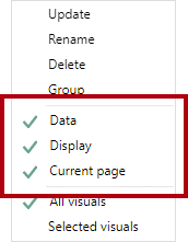
153. The Data state captures anything that impacts the queries that Power BI sends to the semantic model. For example, if a slicer is included in the scope of the bookmark, the Data state retains the applied slicer items when the bookmark was created (or updated). It will also capture sort order and the drill depth of a visual because the query is impacted.
The Display state is related to the visibility of a report object. Objects consist of visuals and also elements like text boxes, buttons, shapes, and images. By using the Selection pane, you can hide or unhide objects and groups of objects. Additionally, you can swap visuals on a report page by creating bookmarks that capture hidden and unhidden objects.
The Current page state determines whether the bookmark will direct the report consumer to the bookmarked page or apply the current page. Disabling the Current page state is rare, but you should consider some creative use cases. For example, on a page tooltip, a bookmark can change the visuals without navigating from the page that the report consumer has selected.
154. Press the Ctrl key to select multiple visuals. The simplest way to select multiple visuals is to use the Selection pane. Also, when you are creating a selected visuals bookmark that shows/hides several objects, create a group of those objects and configure visibility for the group. That way, you can add or remove objects from the group without the need to update the bookmark.
155. For optimal experiences, you should create bookmarks at the end of report development after you have added all report elements. This approach will help you avoid the complex and time-consuming updating of bookmarks when you’re adding new elements.
156. Bookmarks to Rest slicers, Swap Visuals, Drill down multiple visuals and direct depth navigation, Pop-up overlays are the use cases of the Bookmarks.
157. Reset slicers steps 1) bookmark to capture the data state 2) select selected visuals options and ensure to select only the slicers. 3) Set the slicers to default values. 4)Update the bookmark 5) assign the bookmark to the BUTTON ACTION.
158. Swapping a visual means replacing it with another visual. For example, your report can allow the report consumer to select the type of visual, perhaps a chart or a table. Alternatively, you might allow the report user to determine the unit system, whether it’s metric or imperial.
159. Swapping visual steps to follow – 1) Config each bookmark to capture the display state and not the data state 2) Config bookmark to use selected visuals 3) Update the bookmark with one visual visible and another hidden 4) update the second bookmark with reversed visibility 5) Assign the bookmark to button action.
160. bookmarks navigate the matrix visual and the area chart visual across year and month
- Configure each bookmark to capture the Data state, which preserves the drill state of visuals.
- Configure each bookmark to use the Selected visuals scope, targeting the visuals to update.
- In the visuals, drill down to the required level, and then update the corresponding bookmark.
- Assign the bookmarks to button actions.
161. Use buttons and bookmarks to overlay an image, shape, or text box. A good example of a pop-up overlay is one that provides built-in assistance
162. In the following example, when the report consumer selects the Help button in the lower-left corner of the page, a full-page image becomes visible. The image includes many coach marks, which point to the targeted objects on the report page. Also, the image uses transparency so that the underlying report design remains partially visible. When the report consumer selects anywhere on the page, the image becomes hidden (due to an action on the image that uses a bookmark).
163. Two bookmarks are required for creating a pop-up overlay:
- Configure the first bookmark to capture the Display state.
- Ensure that the overlay object is visible, and then update the bookmark.
- Assign the bookmark to a Help button action.
- Configure the second bookmark to capture the Display state.
- Ensure that the overlay object is hidden, and then update the bookmark.
- Assign the bookmark to the overlay object.
164. To ensure seamless integration into your report design, these UX components should be considered early in the design process.
165. Similarly, if a button action drills through to a page, place it as close as possible to the visual that activates it.
166. Buttons need to be clearly interactive. If a button doesn’t appear to be interactive, the report consumer might not notice it. To help in their discovery, you can apply two formatting options: on-hover formatting and descriptive tooltips.
167. In addition to on-hover formatting, you can configure tooltips to concisely communicate what the button does.
168. Visual headers might appear in the upper or lower part of the object. Power BI attempts to show visual headers in the upper right of the object if sufficient space is available between the upper part of the object and the edge of the page. If no space is available in the upper part, Power BI will place the visual headers in the lower-right corner of the visual. If no space is available in either location, it will place the headers inside the visual in the upper right.
169. A report setting is available for you as the report author to disable all visual headers. When visual headers are disabled they will still be visible when editing the report, but they will be hidden for report consumers (in reading view).
170. Visual headers can be turned off for a single object. A good report design turns off visual headers for objects that don’t need them. Therefore, consider turning off visual headers for slicers and buttons and any other object that won’t be used to launch actions. Fewer visual headers will produce a cleaner and less distracting end result.
171. When approaching a report design project, you should always aim to provide “no training required” experiences. Strive to add built-in assistance whenever possible.
172. Several design techniques that can provide built-in assistance include:
- Information page – Adding an information page is the most simplistic technique. Dedicate an entire report page that includes instructions and definitions.
- Visual header tooltip icon - Within the visual header options, you can enable the visual header tooltip. It adds the Help (?) icon to the visual header.
- Button with overlay
173. Performance analyzer allows you to discover how each of your report elements, such as visuals and DAX formulas, are performing. Performance analyzer provides you with logs that measure (in time duration) how each of your report elements performs when users interact with them.
174. Before you run Performance analyzer, ensure that you clear the visual cache and data engine cache; otherwise, the results will not be accurate. Also, you should set up the report so that it opens on a blank page.
175. You can expand an item in the list to view more detailed information and identify the exact cause of the issue, such as the DAX query, the visual display, or something else (other).
176.
177. If you want to examine the DAX query, select Copy query and then paste it into DAX Studio for further analysis. DAX Studio is a free, open-source tool that is provided by another source that you can download and install on your computer.
178. A common reason for poor performance is too many visuals on the same page.
179. Tune performance
- Reduce the number of visuals on the report page because fewer visuals means better performance. If a visual is not necessary and doesn’t add value to the user, you should remove it. Rather than using multiple visuals on the page, consider other ways to provide additional details, such as drillthrough pages and report page tooltips.
- Reduce the number of fields in each visual. The upper limit for visuals is 100 fields, so a visual with more than 100 fields will be slow to load (and will look cluttered and confusing). Identify fields that are not valuable to the visual and then remove them.
180. If you find that visuals are not causing the performance issues, you should assess the DAX query results that are displayed in the Performance analyzer pane and investigate those results further. For example, you might need to look elsewhere in your semantic model, such as the relationships and columns.
181. In circumstances where you have made necessary changes to tune report performance and have established that the report is performing well, but some users are still experiencing poor performance, other factors might be affecting performance.
These factors include the bandwidth, server, firewall, and other external, uncontrollable factors. You might need to speak to the IT team in your organization to see if they can explain why users are experiencing poor performance when using your reports.
182. To create a mobile-optimized version of your report, you can:
- Design a mobile layout view, where you can drag and drop certain visuals onto a phone emulator canvas.
- Use visuals and slicers that are suitable for use on small, mobile screens.
183. if you want to turn off this default responsiveness, you can do so in the General section of the visual’s format settings
184. Regarding slicers, which offer on-canvas filtering of report data, you might want to modify some settings to optimize them for mobile use
- Determine whether you want to allow report readers to select only one item or multiple items.
- Decide on the orientation of the slicer, whether it should be vertical, horizontal, or responsive (responsive slicers must be horizontal). If you make the slicer responsive, as you change its size and shape, it shows more or fewer options. If you make the slicer small enough, it becomes a filter icon on the report page
185. By disabling the More options (…) icon, report consumers can’t export data.
186. The Display state captures the visibility of report objects, such as shapes, images, buttons, and text boxes.
187. Perform analytics in Power Bi
- Explore statistical summary.
- Identify outliers with Power BI visuals.
- Group and bin data for analysis.
- Apply clustering techniques.
- Conduct time series analysis.
- Use the Analyze feature.
- Use advanced analytics custom visuals.
- Review Quick insights.
- Apply AI Insights
188. To avoid performance issues, it’s better to create the statistical measures yourself by using DAX functions to calculate average, sum, min, max, and so on. For example, to analyze the inventory data to find the average order quantity for each product, you could use the following formula:
Average Qty =
AVERAGE ( Sales[Order Qty] )
189. you can represent a histogram with one of the bar or column chart visuals and represent a bell curve with an area chart visual
190. Top N analysis – 1) Q&A feature 2) Top N Filter type 3) DAX Query
191. Top 10 Products =
SUMX ( TOPN ( 10, Product, Product[Total Sales]), [Total Sales] )
192. To create the group, in the Fields pane, right-click the data field that you want to analyze and then select New Group. In this case, you use the OrderQty field
193. Create group – > rename as bin -> Group type as Bin or List -> Bin Type as Number of Bins – > Bin count, Min and Max are auto calculated.
194. The process of identifying outliers involves segmenting your data into two groups: one group is the outlier data and the other group is not. You could use calculated columns to identify outliers, but the results would be static until you refresh the data. A better way to identify outliers is to use a visualization or DAX formula because these methods will ensure that your results are dynamic.
195. Use the Analytics paneWith the Analytics pane, you can create the following types of dynamic reference lines:
- X-Axis constant line
- Y-Axis constant line
- Min line
- Max line
- Average line
- Median line
- Percentile line
- Symmetry shading
196. You might use x-axis constant line, y-axis constant line, and symmetry shading on the following visual:
- Scatter chart
Use of constant line, min line, max line, average line, median line, and percentile line is available on these visuals:
- Area chart
- Clustered bar chart
- Clustered column chart
- Line chart
- Scatter chart
The following visuals can use only a constant line from the Analytics pane:
- Stacked area chart
- Stacked bar chart
- Stacked column chart
- Waterfall chart
- 100% Stacked bar chart
- 100% Stacked column chart
The following visuals can use a trend line if there’s time data:
- Area chart
- Clustered column chart
- Line chart
- Line and clustered column chart
- Scatter chart
You can’t apply any dynamic lines to these visuals:
- Funnel
- Line and clustered column chart
- Line and stacked column chart
- Ribbon chart
- Non-Cartesian visuals, such as Donut charts, Gauge, Matrix, Pie chart, and Table
197. Outliers using DAX
Outliers =
CALCULATE (
[Order Qty],
FILTER (
VALUES ( Product[Product Name] ),
COUNTROWS ( FILTER ( Sales, [Order Qty] >= [Min Qty] ) ) > 0
)
)
198. Grouping is used for categories of data. Binning is similar to grouping, but it is used for grouping continuous fields, such as numbers and dates.
199. To create the group, use Ctrl + click to select the data points on the visual that you want to group. In this case, it’s states with sales greater than 500,000 dollars. Right-click one of those selected data points and then select the Group data option.
200. The process of binning allows you to group your numerical and time field data into “bins” of equal size. This approach allows you to visualize and identify trends in your data in more meaningful ways. Binning allows you to right-size the data that Power BI Desktop displays.
201. In this example, you want to create bins (groups) for the Order Qty field. Start in the Fields pane by right-clicking the Order Qty field that you want to create the bins for, and then select New Group. On the Groups window that displays, set the Bin size to the size that you want, adjust other settings as required, and then select OK.
202. Clustering allows you to identify a segment (cluster) of data that is similar to each other but dissimilar to the rest of the data. The process of clustering is different to that of grouping, which you accomplished previously.
203. To apply clustering to your scatter chart, select More options (…) in the upper-right corner of the visual and then select Automatically find clusters.
204. Enter the number of clusters that you want (3) into the box and then select OK. Power BI will run the clustering algorithm and create a new categorical field with the different cluster groups in it. Now, when you look at the visual, you can clearly see the clusters that are in your data and proceed to perform analysis on them.
205. In the preceding example, when you applied clustering to the scatter chart, you could only use two measures. If you want to find clusters by using more than two measures, you can use a table visual instead
206. A message will display, stating that the visual was successfully imported. When you return to Power BI Desktop, you’ll see the new Play Axis icon in the Visualizations pane. Select the page, and then select the Play Axis icon to add that visual to the page.
207. To use the Analyze feature, right-click a data point on the visual and then hover over the Analyze option to display two further options: Explain the increase and Find where the distribution is different. The options that are available will depend on the data point that you selected.
208. You can use what-if parameters to run scenarios and scenario-type analysis on your data. What-if parameters are powerful additions to your Power BI semantic models and reports because they enable you to look at historical data to analyze potential outcomes if a different scenario had occurred. Additionally, what-if parameters can help you look forward, to predict or forecast what could happen in the future
209. Paginated reports allow report developers to create Power BI artifacts that have tightly controlled rendering requirements. Paginated reports are ideal for creating sales invoices, receipts, purchase orders, and tabular data.
210. Paginated reports give a pixel-perfect view of the data. Pixel perfect means that you have total control of how the report renders. If you want a footer on every sales receipt that you create, a paginated report is the appropriate solution. If you want a certain customer’s name to always appear in green font on a report, you can do that in a paginated report.
211 Power BI paginated reports are descendants of SQL Server Reporting Services (SSRS), which was first introduced in 2004. Power BI paginated reports and SSRS have a lot in common
212. You can have customized sort orders, clickable headers, and URLs in results, which allows for simple integration with custom applications.
213. Power BI paginated reports are not created in Power BI Desktop; they are built by using Power BI Report Builder. You can share paginated reports with either a Power BI Pro or a Power BI premium license.
214. Data can be collected from multiple data sources, including Microsoft Excel, Oracle, SQL Server, and many more. However, after the data has been collected, the different data sources cannot be merged into a single semantic model. Each source must be used for a different purpose. For instance, data from an Excel source can be used for a chart, while data from SQL Server can be used for a table on a single report.
215. To create a report, you must add a visual to the design surface, similar to what you would do in Power BI Desktop. Select the Insert tab from the ribbon at the top to see your options for adding a visual.
216. Consider the scenario where you are creating a report that retrieves data from a sales database. You only want sales data from between a begin date and an end date. In this case, you would create two parameters and then modify the dataset query to include those parameters in the WHERE clause of the query. Your first step in this situation is to add a parameter
217.
218. Best practices
Creating a report is meant to inform and drive action on the part of the report user. It isn’t enough to create a report with sales information on it; the report author should always ask themselves several questions:
- What purpose is this report for?
- Who is using the report?
- How can I help people do a better job?
- What is the most important information and how can I highlight it?
- Is this report readable?
- Can people change the elements that they need to if their questions change?
- Do I have visuals that are distracting from the core message of the report?
- Is this report staying focused in a single topic or only a few topics?
- Am I providing all the information that the user expects to see in the report?
219. report authors should ask themselves the following questions to test the appropriate delivery format and ensure that the report is rendering correctly in that format:
- Does the user want the report sent to them in an email message?
- Does the user want the report in a printable format?
- Does the user read the report in a web browser?
220. Parameters can be used in the report dataset, the report design surface, and other places. Users insert values into the available parameters, and the report author uses those values in the appropriate location in the report.
221. The three main AI visuals are:
- Key influencers
- Decomposition tree
- Q&A
221. the visual helps report consumers understand the important dimensions that contribute to won sales opportunities. According to the visual, when the discount rate increases by two percent, the likelihood of a won sales opportunity increases by a factor of 2.76.
222. the Key influencers visual includes the Top segments view, which shows the highest-ranking segments that contribute to a particular metric.
223.
224. Key elements of the visual are as follows:
- Tabs: Select a tab to switch between views. Key influencers shows you the top contributors to the selected metric value. Top segments shows you the top segments that contribute to the selected metric value. A segment is made up of a combination of values. For example, one segment might be consumers who have been customers for at least 20 years and live in the west region.
- Drop-down box: The value of the metric under investigation. In this example, look at the metric Rating. The selected value is Low.
- Restatement: It helps you interpret the visual in the left pane.
- Left pane: The left pane contains one visual. In this case, the left pane shows a list of the top key influencers.
- Restatement: It helps you interpret the visual in the right pane.
- Right pane: The right pane contains one visual. In this case, the column chart displays all the values for the key influencer Theme that was selected in the left pane. The specific value of usability from the left pane is shown in green. All the other values for Theme are shown in black.
- Average line: The average is calculated for all possible values for Theme except usability (which is the selected influencer). So the calculation applies to all the values in black. It tells you what percentage of the other Themes had a low rating. In this case 11.35% had a low rating (shown by the dotted line).
- Check box: Filters out the visual in the right pane to only show values that are influencers for that field. In this example, the visual is filtered to display usability, security, and navigation.
225.
226. Move the metric you want to investigate into the Analyze field. To see what drives a customer rating of the service to be low, select Customer Table > Rating.
- Move fields that you think might influence Rating into the Explain by field. You can move as many fields as you want. In this case, start with:
- Country-Region
- Role in Org
- Subscription Type
- Company Size
- Theme
- Leave the Expand by field empty. This field is only used when analyzing a measure or summarized field.
227. The Decomposition Tree visual helps report consumers visualize data across multiple dimensions. It automatically aggregates data and enables consumers to drill down into dimensions in any order
228. The lock icon next to the Prod Category split means that the report author added the split and set it so that it can’t be removed. Additionally, the light bulb icon next to the Region split means that the report consumer used an AI split to discover the best split.
229. It’s also an artificial intelligence (AI) visualization, so you can ask it to find the next dimension to drill down into based on certain criteria. This tool is valuable for ad hoc exploration and conducting root cause analysis.
230.
231. Use case of decomposition visual
- A supply chain scenario that analyzes the percentage of products a company has on backorder (out of stock).
- A sales scenario that breaks down video game sales by numerous factors like game genre and publisher.
232. Sharing your report with a Power BI colleague requires that you both have individual Power BI Pro licenses or that the report is saved in Premium capacity.
233. The visualization requires two types of input:
- Analyze – the metric you would like to analyze. It must be a measure or an aggregate.
- Explain By – one or more dimensions you would like to drill down into.
233. The visualization requires two types of input:
- Analyze – the metric you would like to analyze. It must be a measure or an aggregate.
- Explain By – one or more dimensions you would like to drill down into.
234. The maximum number of levels for the tree is 50. Maximum number of data points that can be visualized at one time on the tree is 5000. We truncate levels to show top n. Currently the top n per level is set to 10.
235. The decomposition tree isn’t supported in the following scenarios:
- On-premises Analysis Services
236. AI splits aren’t supported in the following scenarios:
- Azure Analysis Services
- Power BI Report Server
- Publish to Web
- Complex measures and measures from extensions schemas in ‘Analyze’.
237. Power BI has multiple insights features that use artificial intelligence (AI):
- Insights for reports: Analyzes data and finds anomalies and trends in your data as you interact with reports.
- Insights for individual visuals: Analyzes and explains the fluctuations of data points in visuals.
- Insights for dashboard tiles: Looks at the data being used to render that tile and presents them in interactive visuals.
- Quick Insights for semantic models: Automatically generate data insights on a semantic model in the Power BI service.
238. The Insights pane currently shows three types of insights:
- Anomalies: Represents something that is out of the ordinary from what is expected. For example, a smart thermostat that suddenly reads the temperature as 100 F when it’s typically 72 F would be considered an anomaly.
- Trends: Represents a pattern that is found in time-series semantic models. For example, if a company’s sales are steadily increasing through the month of April, that would represent a trend.
- Key Performance Indicator (KPI) analysis: Helps you evaluate the current value against a defined target. For example, a company might set a sales goal at 1.2 million, but currently they are at 1 million.
239. There are three types of anomaly insights:
- Significant anomaly: The anomaly has a high score. Anomaly score indicates how far the point is from the expected range.
- Recent anomaly: The most recent anomaly in the measure.
- Anomaly summary: This insight type summarizes multiple anomalies in the measure.
240. There are four main trends flagged:
- Long trend: The trend is significant and is the longest trend within a single series or across multiple series in a visual.
- Steep trend: The trend is significant and is the steepest trend within a single series or across multiple series in a visual.
- Recent trend: The trend is significant and is the most recent trend within a single series or across multiple series in a visual.
- Trend reversal: Recent trend in a single series or across multiple series in a visual where the reversal is significant, compared to the previous trend segment.
241. KPI analysis with a target looks at the variance of the current value to its target. It’s considered significant if the variance is high or low compared to other segments. KPI analysis without a target looks at the value itself and flags ones that are high or low compared to other segments.
Discover more from LR Virtual Classroom
Subscribe to get the latest posts sent to your email.
 LR Virtual Classroom