
Excel’s Power Pivot is a standard Excel desktop feature. Power Pivot along with Power Query with Pivot table and Pivot Chart is the wonderful combination in the Excel for data analysis of huge data sets.
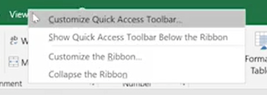
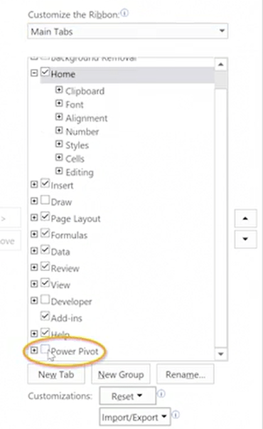
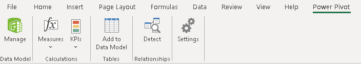
To enable Power Pivot menu, simply right click on the toolbar and then select customize this ribbon. Over to the right here make sure that main tabs is selected and you should see Power Pivot appear at the very bottom of the list.
Power Feature 1 – Source data from anywhere.
Source any format of data into Excel by using the Get Data under Data Menu. Under Data Model, select Manage, and then choose Get External Data. This is the direct path to bring you to the location where you can decide which data sources you may want to use in your data model.
Check the Power Query post on Excel Automation using Power Query & A-Z of Power Query. The post gives you the ETL process that you can perform using Power Query function.
Power Feature 2 – Create & Manage relationships
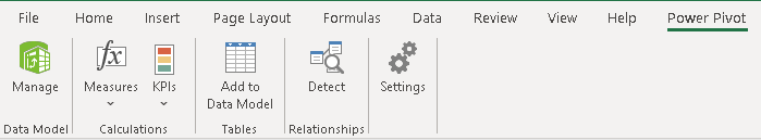
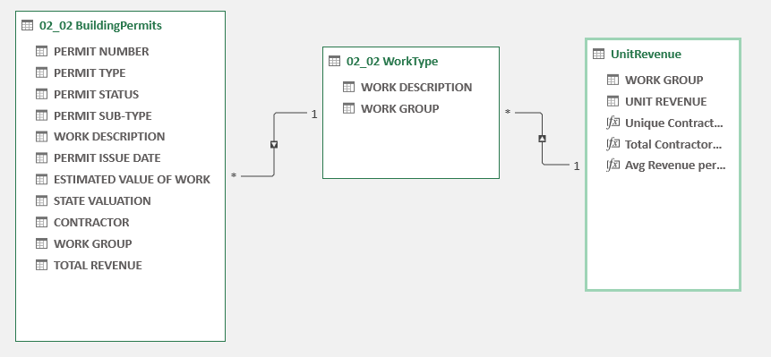
After importing the data into excel, then the important step is to create relationship between the tables. Identify the common columns between tables and create relationship by dragging the fields. This can be done under “Manager” in Power Pivot menu.
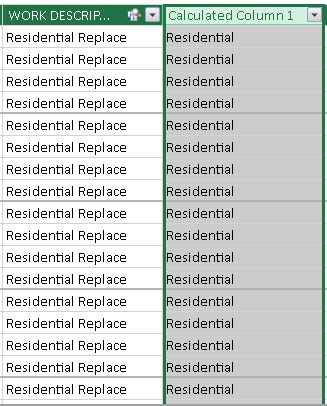
Power Feature 3 – Add calculated Columns
Next important feature is the ability to create inbuilt calculated columns. Calculated columns and measures are two very important concepts to understand in Power Pivot. You can perform row by row calculations or pull the data from other table like shown below. A calculated column is computed at report refresh level. The work group column is calculated based on the work description field.
When to use Calculated Column – When you want a slicer on a report use a calculated column not a measure. If you want to see your results in rows, columns or in a matrix or pivot table

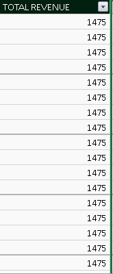
Another DAX formula to calculate the Total Revenue as below

Power Feature 4 – Create Measures
A Measure is computed at the query refresh level. When creating measures from a table of data an aggregate need to be used but an aggregate is not necessary for calculated columns.
When presenting values as aggregates in a report
- Examples: Calculate the profit percentage or a report selection
- Examples: Calculate ratios of a product compared to all products
- We don’t use measures in slicers but can be used in other visualizations like cards, bar charts etc.
Calculated Column Formula: Sales[GrossMargin] = Sales[SalesAmount] – Sales[TotalProductCosts]
Calculated Measure Formula: GrossMargin : = SUM(SalesAmount]) – SUM(Sales[TotalProductCosts])
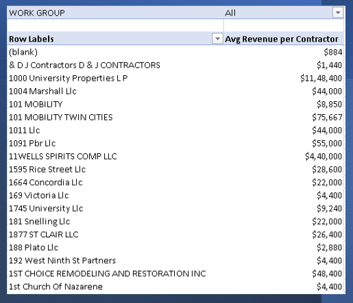
Lets take a real example, below is the sum of Total revenue calculated to perform the average no. revenue per contractor.
Sum Revenue:=SUM('02_02 BuildingPermits'[TOTAL REVENUE])Unique No. of Contractors:=DISTINCTCOUNT('02_02 BuildingPermits'[CONTRACTOR])Average Revenue/Contractor:=[Sum Revenue]/[Unique No. of Contractors]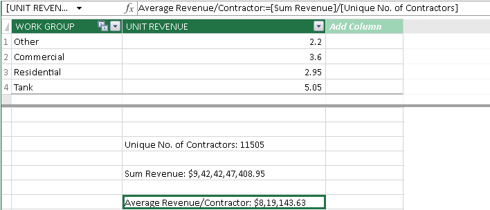
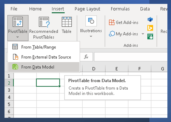
Power Feature 5 – Analyze results using Pivot Tables
Once you have the necessary calculations and measures, now its time to analyze by using Pivot tables. When inserting Pivot tables, ensure, it is created by using the Workbook’s Data model”.
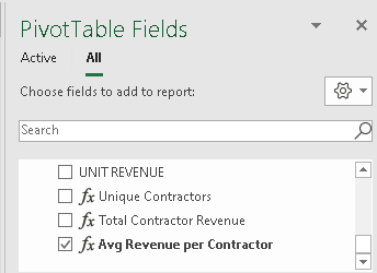
The measures which we created are displayed as below and subsequent picture shows the pivot table created using the measure Avg Revenue per contractor.
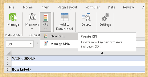
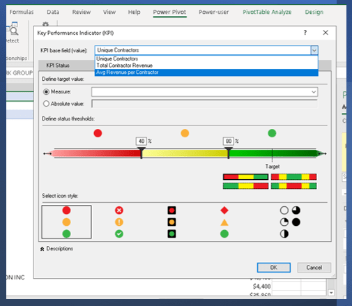
Power Feature 6 – Create & Manage KPI’s
Key Performance indicators are the wonderful way to show the value from your data model. You can create numerous KPI’s and display them as Cards visualization.
Click Create KPI to create new KPI metric. You can find the list of all the KPI’s under Manage KPI.
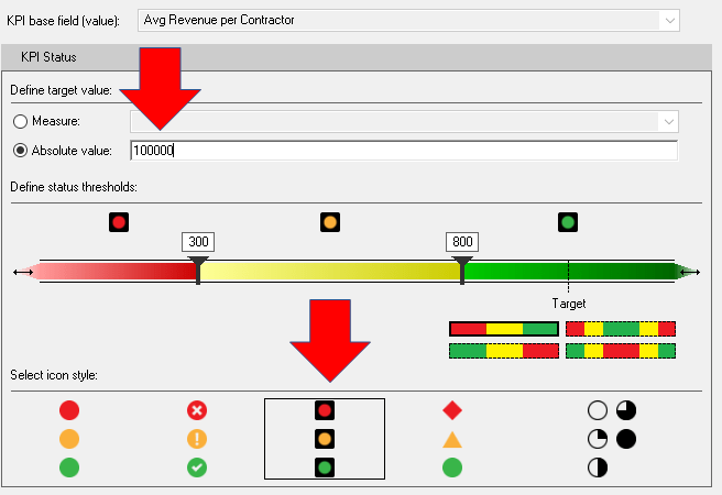
The Manage KPI dialog box appears when you choose KPIs, and the Define Status Thresholds bar is in the middle of the dialogue box. Below shows the all the measures that are created in the data model. Make sure you select the absolute measure based on the data range.
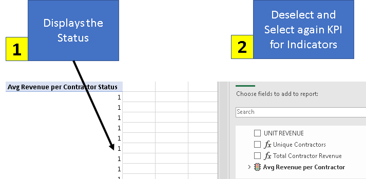
By default, when you add the KPI to the Pivot table, it is displayed as Status. You can remove the field and then re-add the KPI field from the Pivot fields. This is important step to get the KPI indicators.
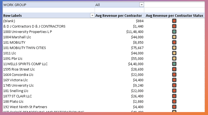
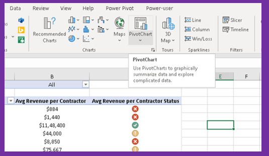
Our beautiful Pivot table is ready with measure and KPI.
Power Feature 7 – Illustrate the results using Pivot Charts
With Power Pivot, you can quickly illustrate the results of your data model using Excel’s in-built Pivot Charts.
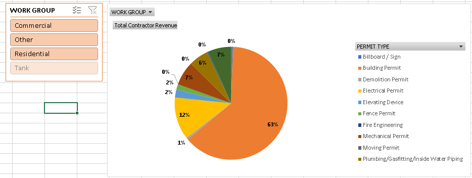
Below is the Pivot chart created and data is sliced using the slicers.
Hope you found the post informative. Your valuable feedback, question, or comments about this post are always welcome by leaving me a message on contact form is truly appreciated.
Discover more from LR Virtual Classroom
Subscribe to get the latest posts sent to your email.
