
Here’s a tit-bits about Charts. Data visualization is the key in any industry. Took time to learn some shortcuts and standard techniques.
1.Press Alt + F1 to insert the chart in same worksheet and F11 to create in different work sheet.
2.Understand the chart type before populating the data. Try different varieties and then select the type of chart based on the data type.
3.Always don’t forget to look for chart design types. It gives lots of customized options play with chart representation.
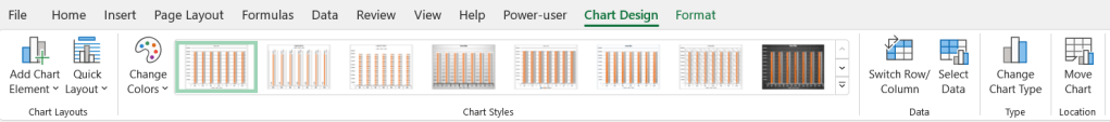
4.Switch Row and column feature in the chart design is very useful when you want to shift the rows and columns which gives another dimension to view the data.
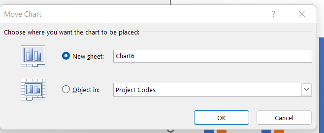
5.Move the chart from one sheet to another by using Move chart. It helps to keep the kinking of the cells intact.
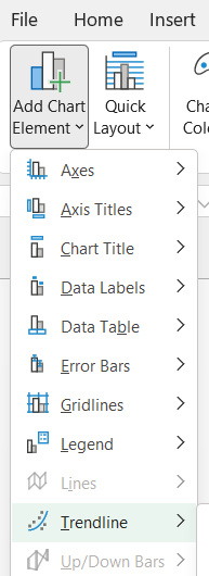
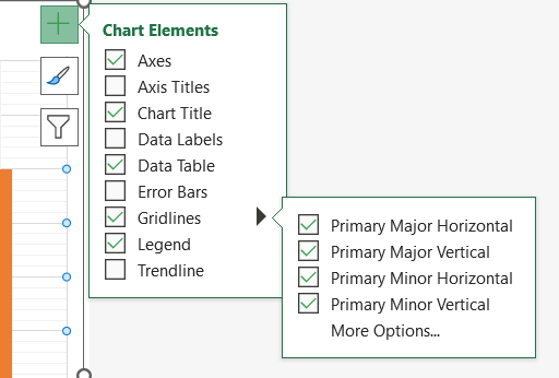
6.Adding various kinds of data elements is a must to try on to make your chart more intuitive.
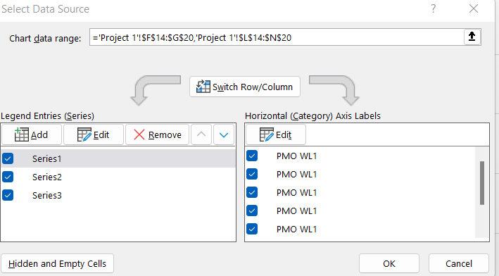
7.When you want to change the data source, say add another field into the chart, then copy the column and paste (ctrl+v) in the chart area. This will avoid selecting the data source again and again.
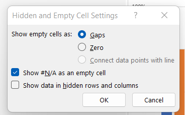
8.Dealing with empty and hidden cells.
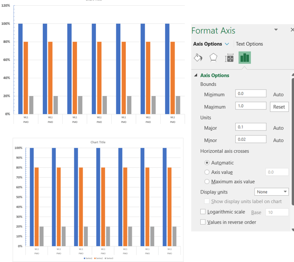
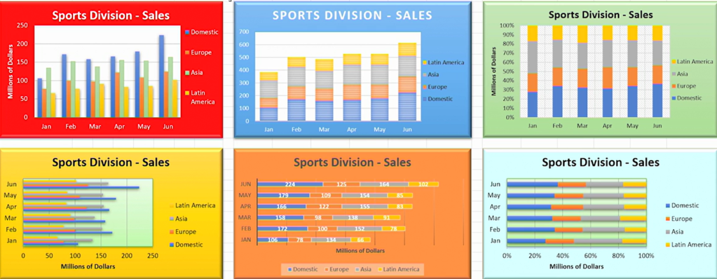
9.Changing the max and min axes type, range and labels is very key chart element. Note the difference in below two chart Y axis – one with 120% and another with 100%.
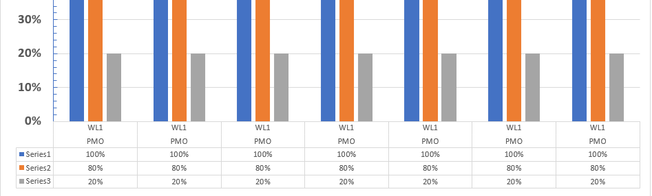
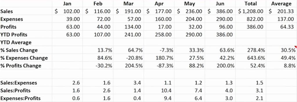
10.Make use of the data table in chart feature as below. If the chart is not so readable, this will solve the problem. And also give direct data for someone who wants to see the data table.
11.Gridlines makes the chart more readable.
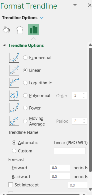
12.Remember to add trend lines when you are creating line/bar chart.
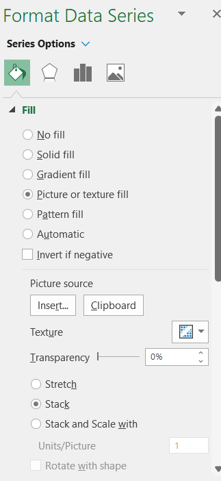
13.Picture as the chart elements – This is interesting if you want to create funky charts for your fun events.
13. Shape Effects is very powerful feature to use in the dashboard. It can be applied to chart title, legends or the entire chart itself. Bevel is my personal favorite as shown below.
14.Add floating text and text boxes – It will enlighten the chart little bit. Bring out some of the issues that you want to bring out, say, during a presentation.
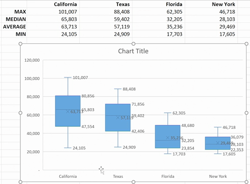
15.New chart types are below:
- Tree map
- Sunburst
- Histogram
- Box and whisker
- Pareto chart
- Waterfall and funnel charts
16. Create charts from multiple data sources – Use Ctrl + c and Ctrl+v on the plot area.
17. Use a table as source data for a chart – It will help to expand the data and update the chart dynamically.
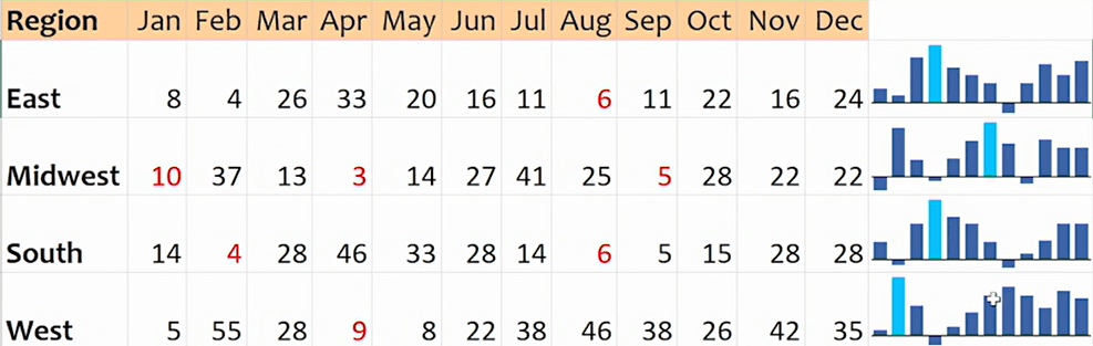
18. Create graphic-in-cell charts with sparklines
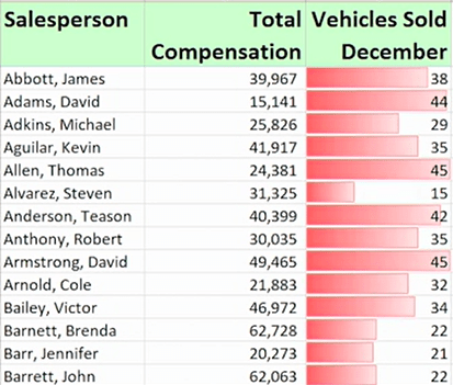
19.Create in-cell bar charts with conditional formatting
Discover more from LR Virtual Classroom
Subscribe to get the latest posts sent to your email.
