“Data is the new oil”. Yes, Michael Palmer expanded on Humby’s quote by saying, like oil, data is “valuable, but if unrefined it cannot really be used.
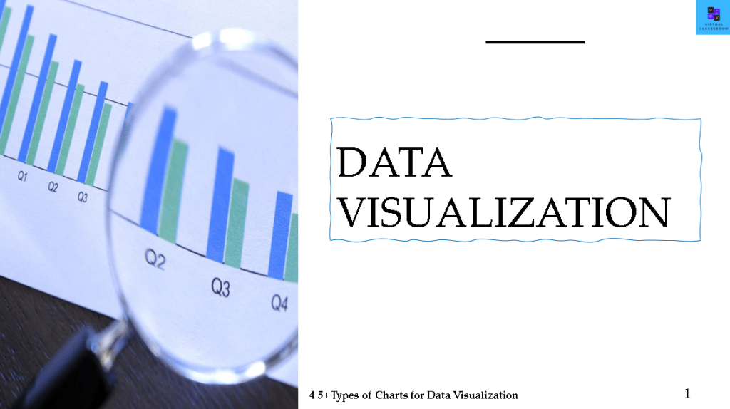
Data Visualization
In the era of digital technology, more and more data piles up. Being in PMO, you get your hands on with data every day to measure the performance of the resource, team, project, program or portfolio and even the organization. So having knowledge about data visualization is really need of the hour to help data to be easily understood and accepted. More ever,
- It helps to comprehend the huge sets of data easily at a quick glance.
- Identify the outliers, trends, patterns etc.
- Helps to achieve your targeted goals and not lose focus.
- Helps you to tell a story about the data…I mean loads of data.
- Aids in effective data driven decision making process.
By contrast, visualization will be more intuitive and meaningful, and it is very important to use appropriate charts to visualize data.
It depends on various factors like No. of parameters of data available, the output result you would like to view etc.
In other words, simple mantra for using data visualization techniques is to ” KEEP IT SIMPLE AND SIGNIFICANT”
In this post, I will introduce the top 45+ types of data visualization from my experience and explain about each of them to help you quickly select the type of chart that shows the characteristics of your data.
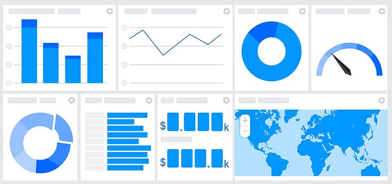
The 45+ types of Charts which we are going to cover is as below:
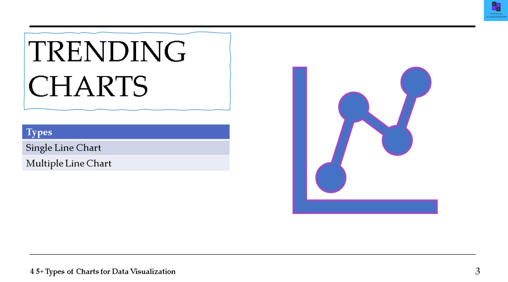
- TRENDING CHARTS
- Single Line chart
- Multiple Line chart
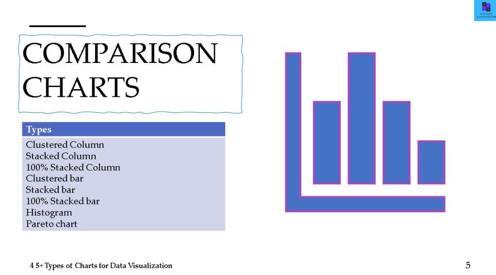
- COMPARISON CHARTS
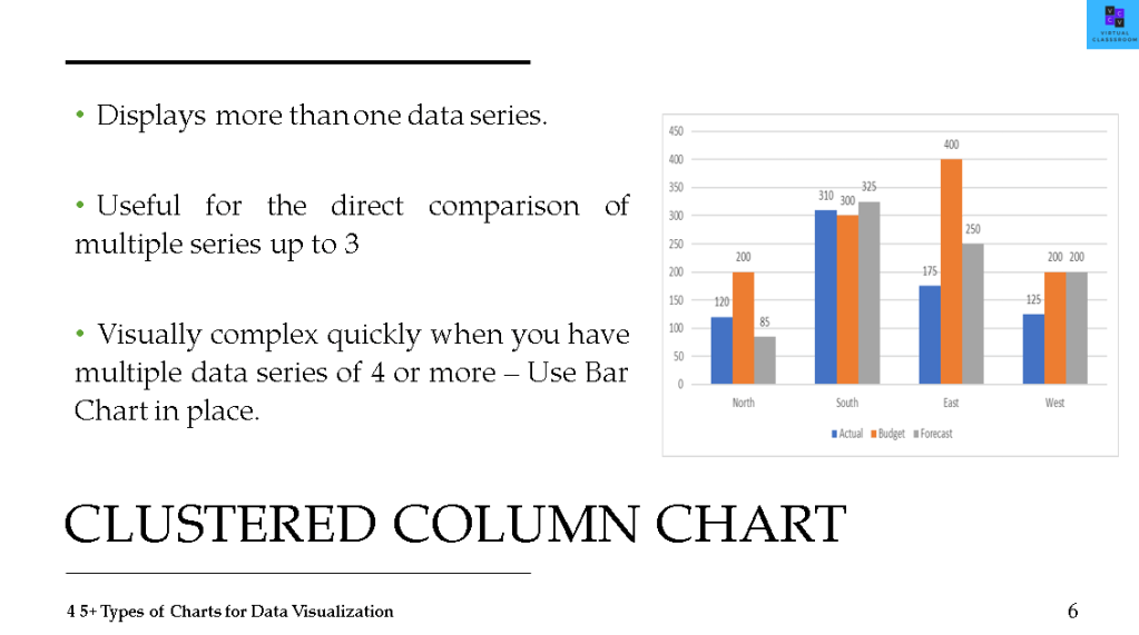
- Clustered Column
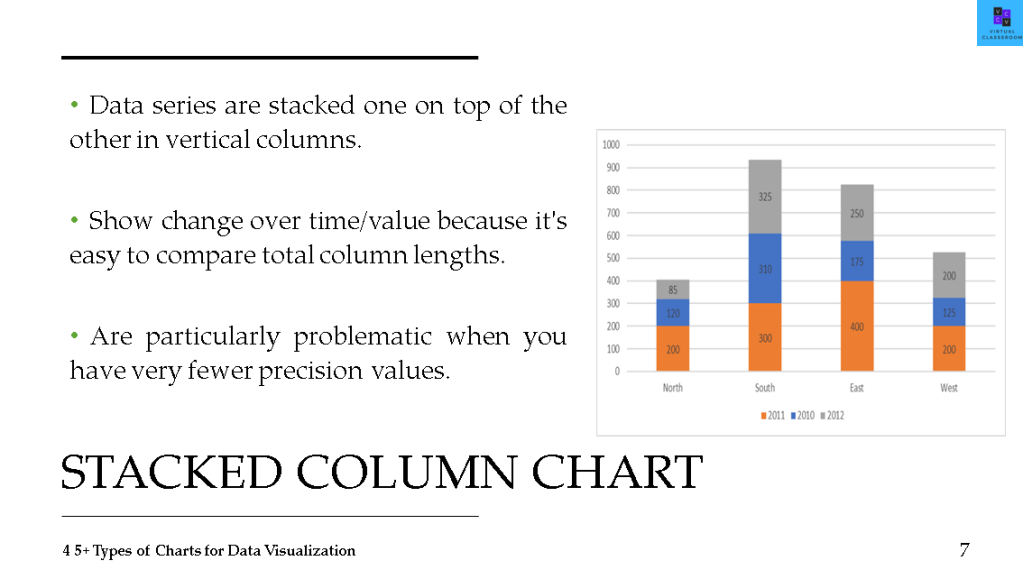
- Stacked Column
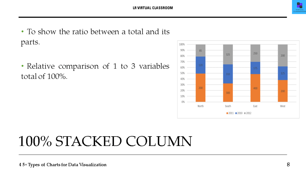
- 100% Stacked Column
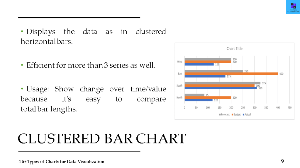
- Clustered bar
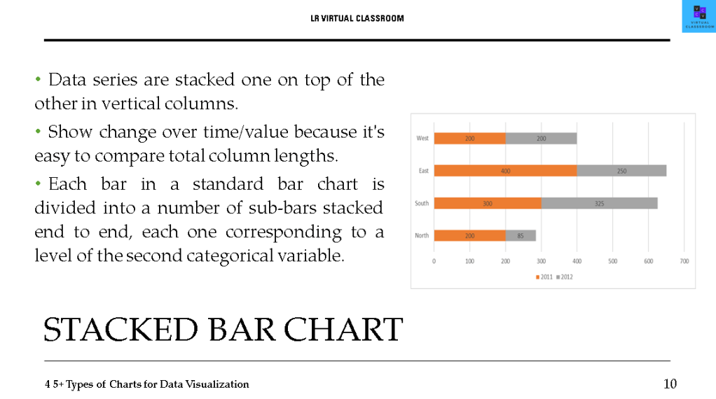
- Stacked bar
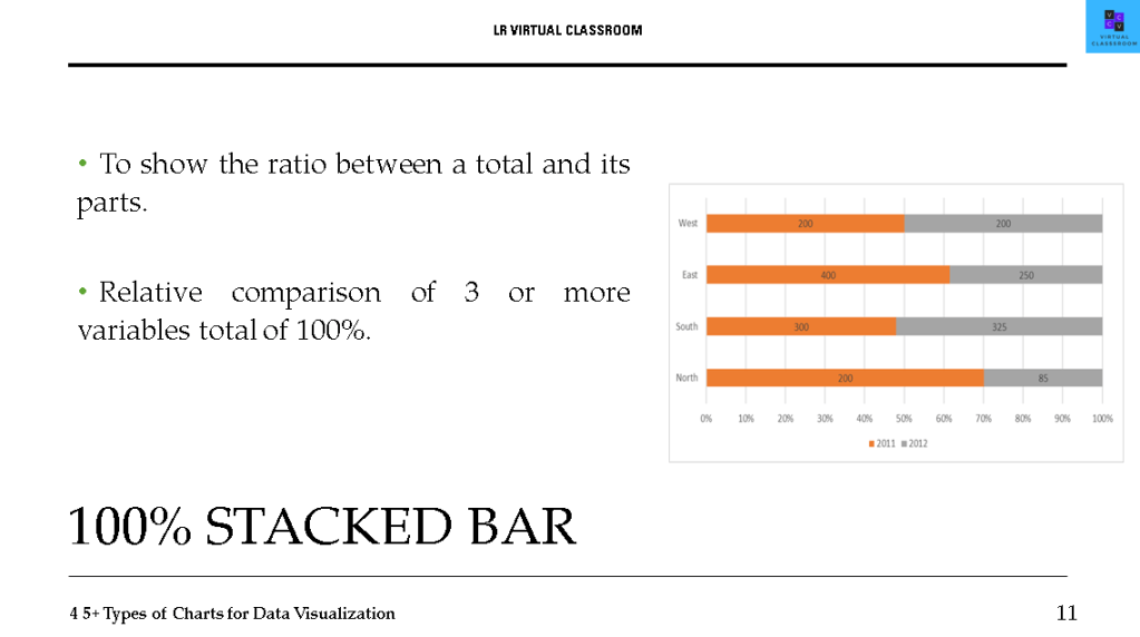
- 100% Stacked bar
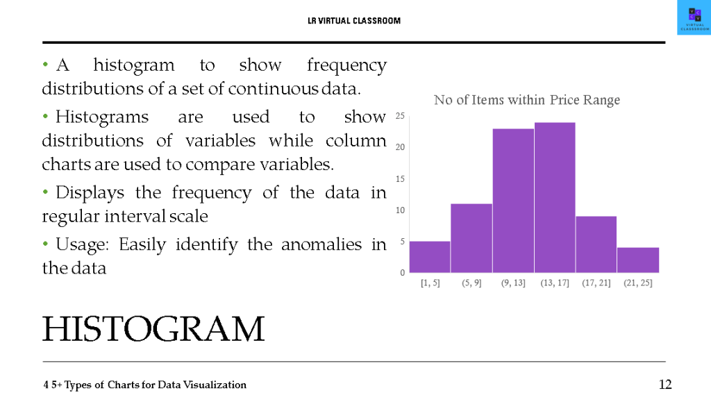
- Histogram
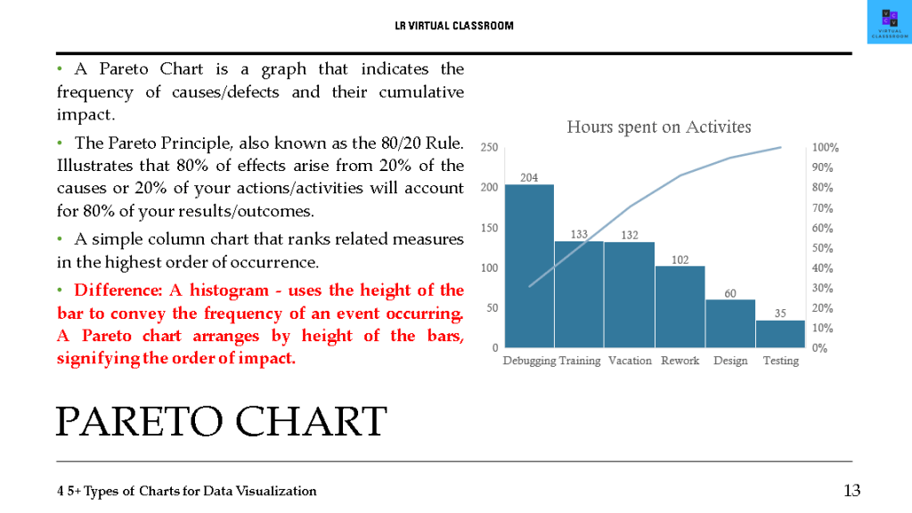
- Pareto chart
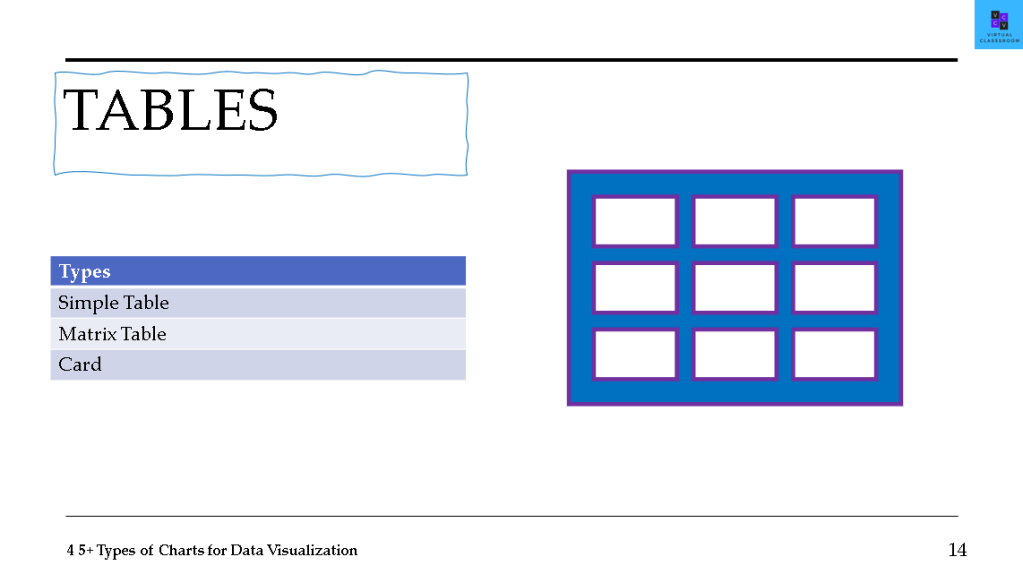
- TABLES
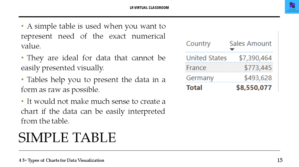
- Simple Table
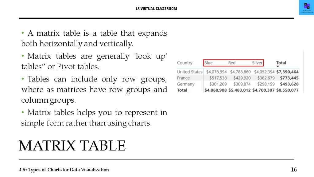
- Matrix Table
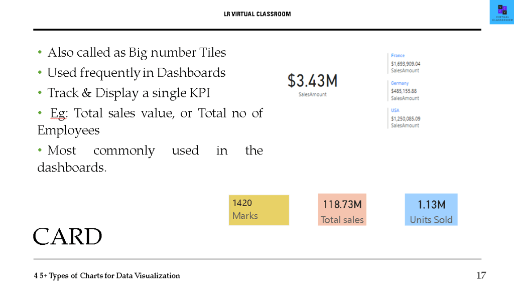
- Cards
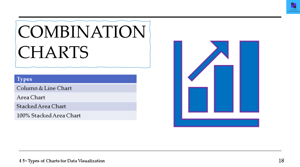
- COMBINATION CHARTS
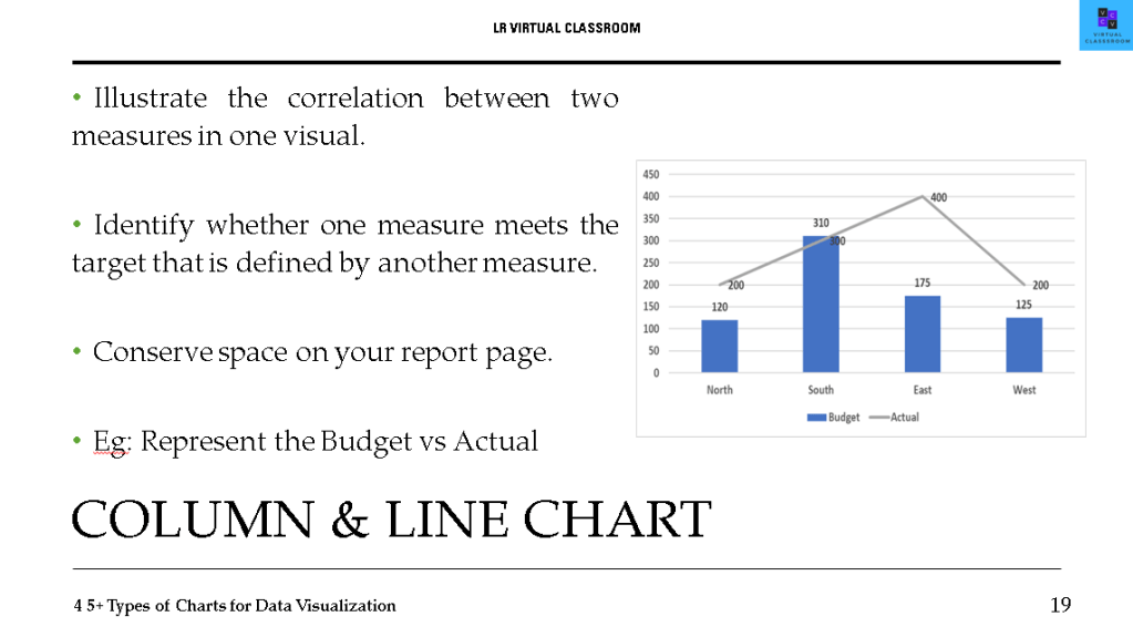
- Column & Line chart
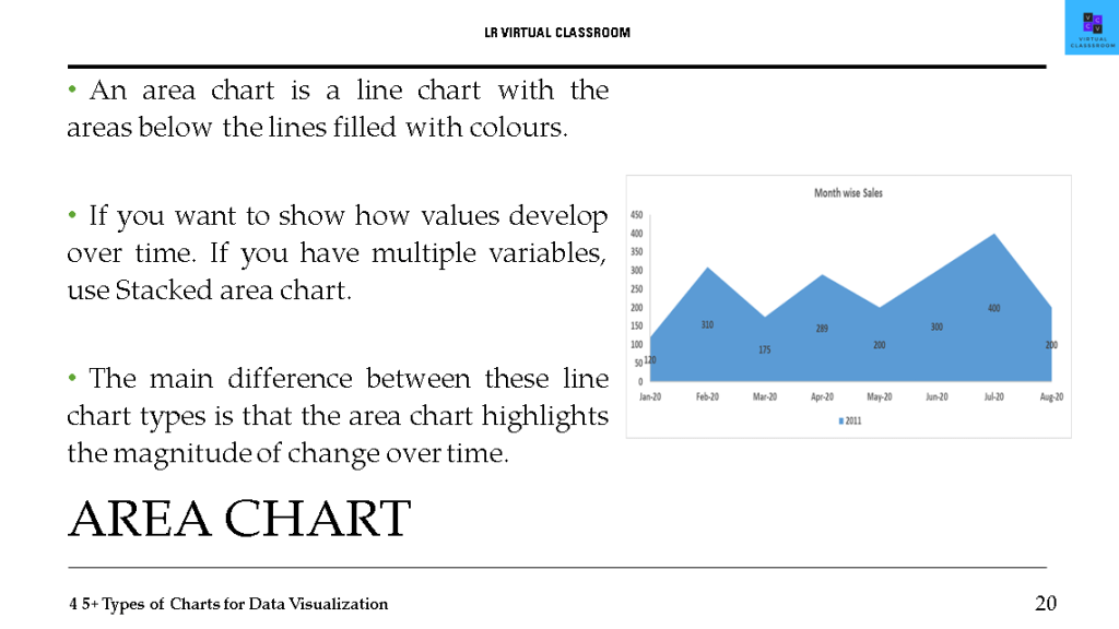
- Area chart
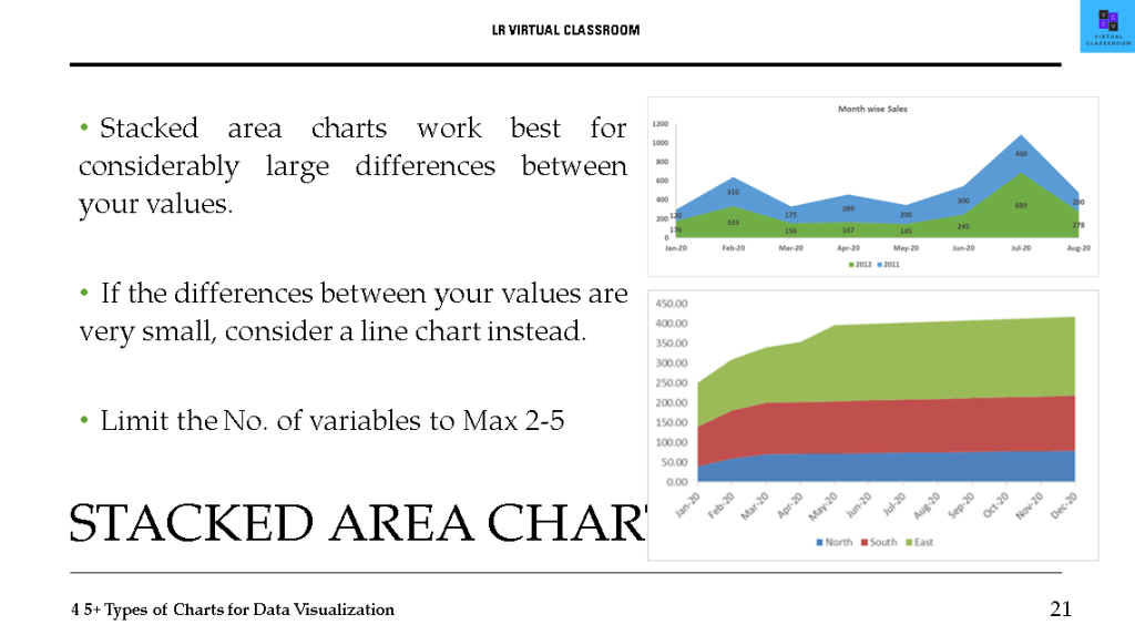
- Stacked area chart
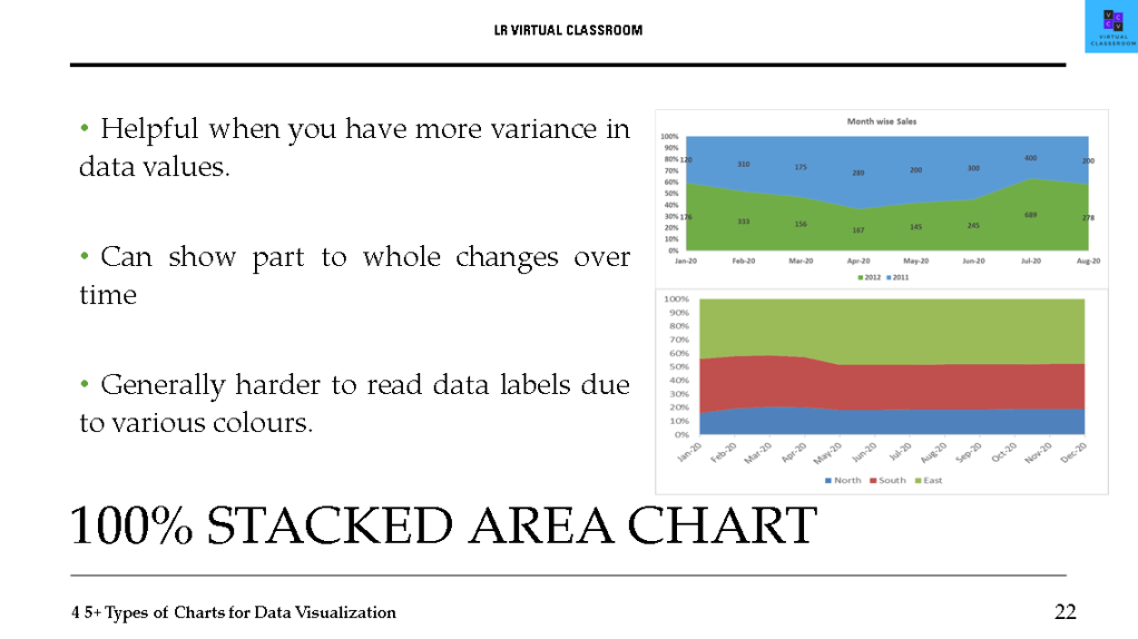
- 100% Stacked area chart
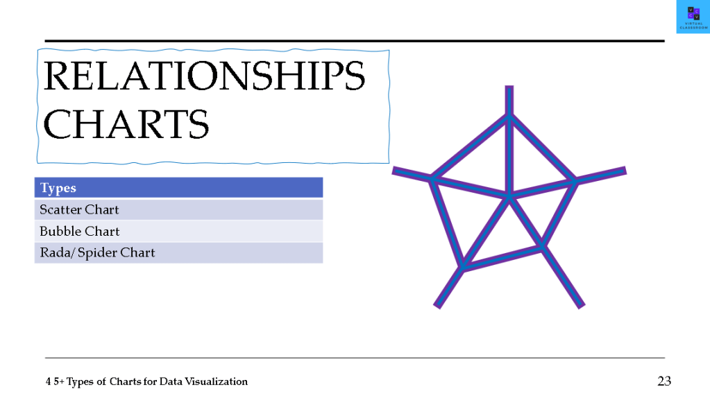
- RELANTIONSHIP CHARTS
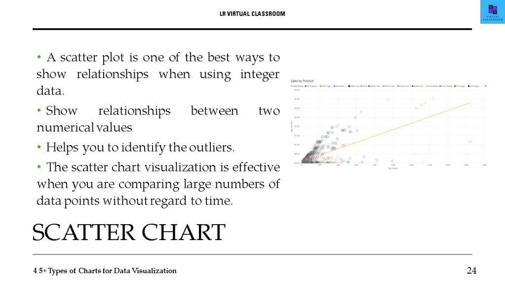
- Scatter chart
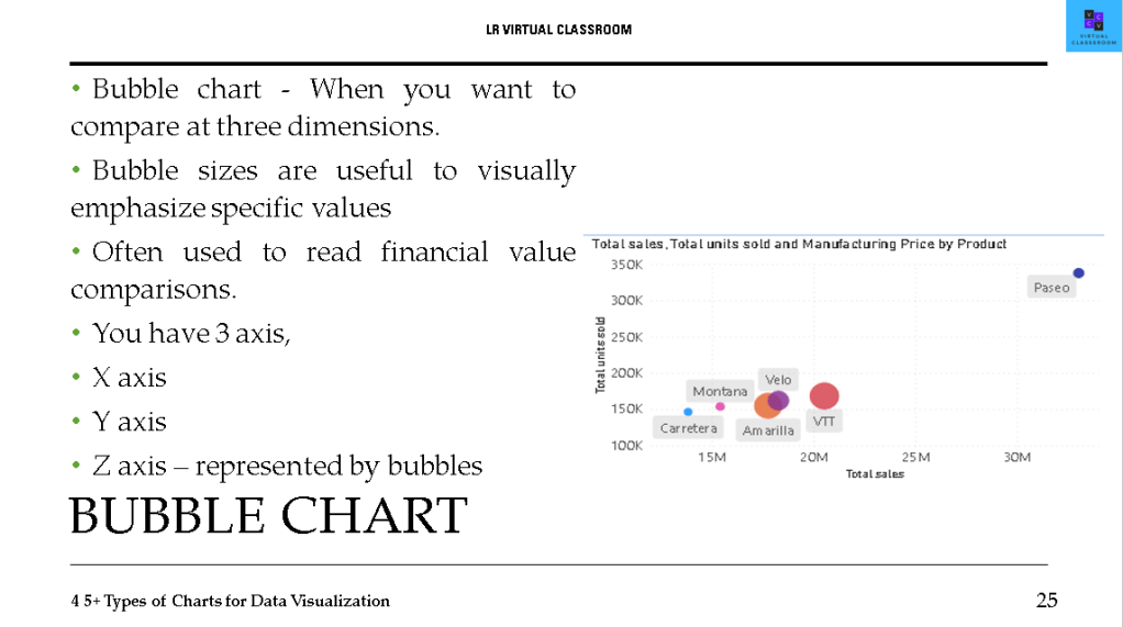
- Bubble chart
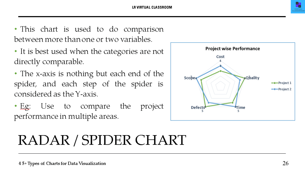
- Radar / Spider chart
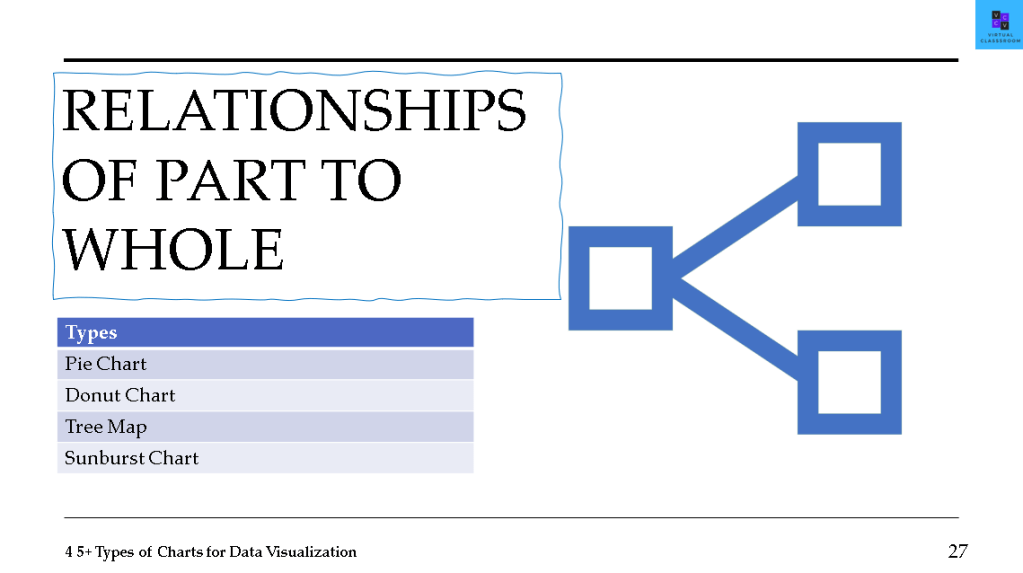
- RELANTIONSHIPS WHOLE TO PART
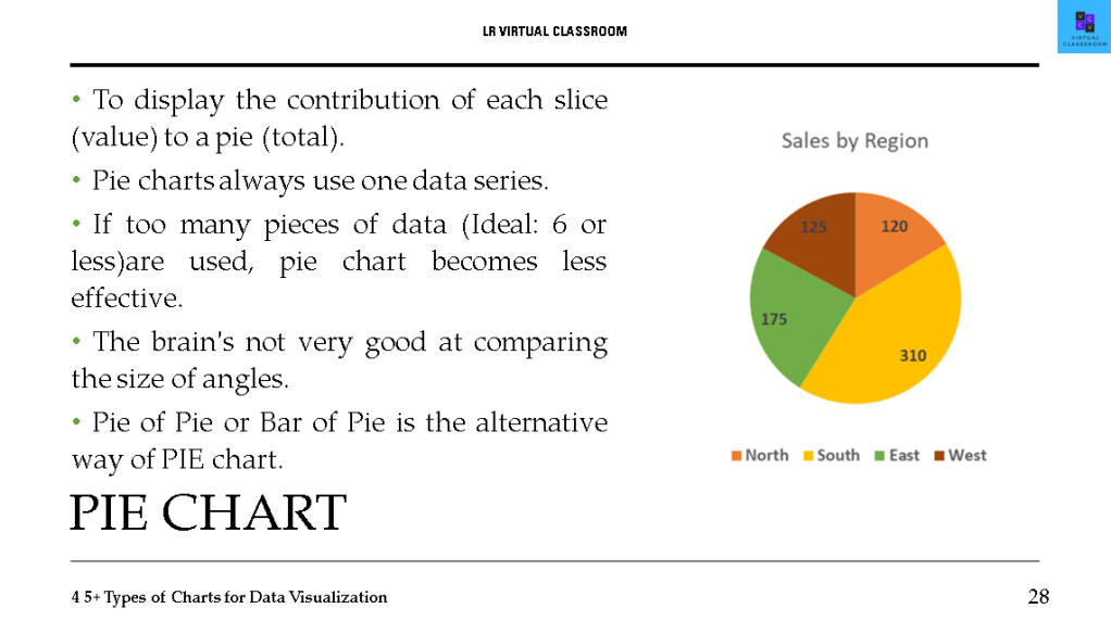
- PIE chart
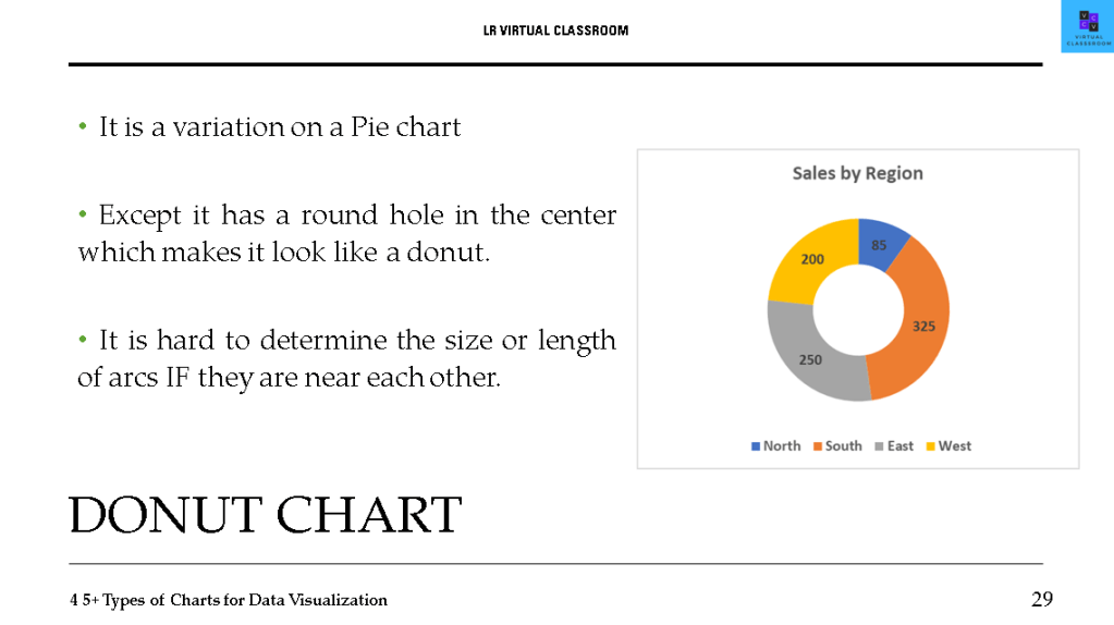
- Donut chart
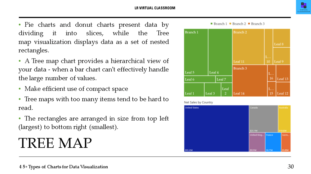
- Tree Map
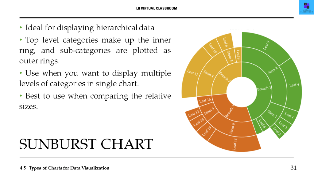
- Sunburst chart
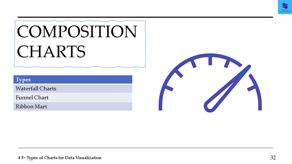
- COMPOSITION CHARTS
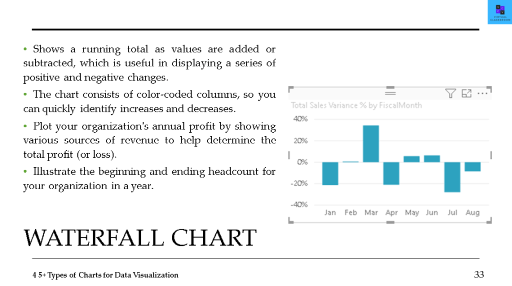
- Waterfall chart
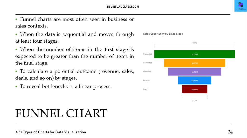
- Funnel chart
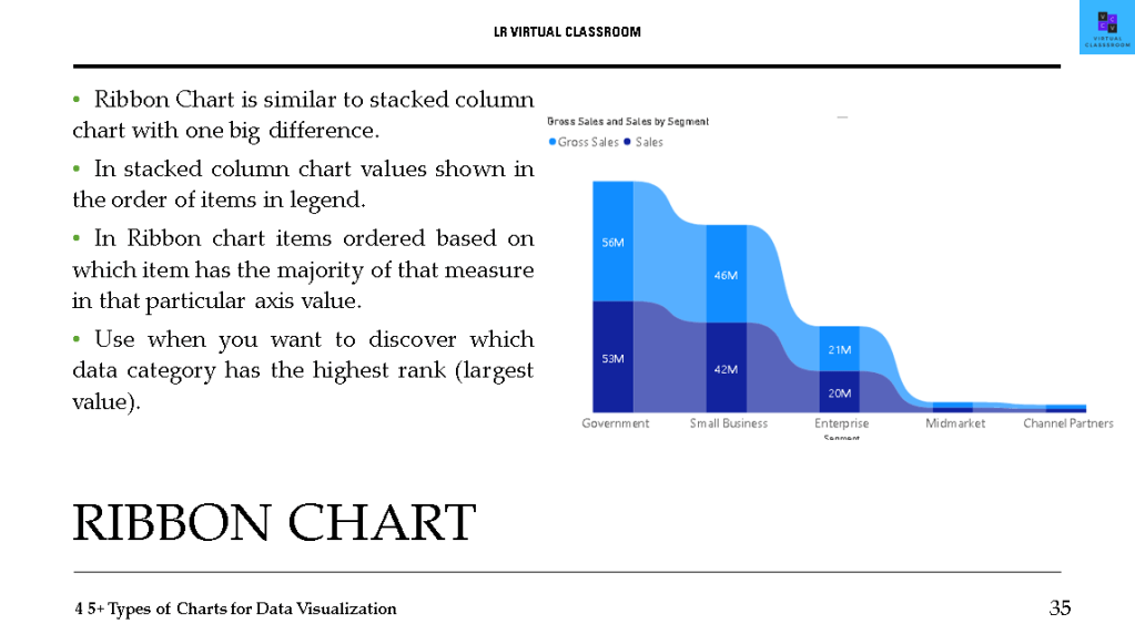
- Ribbon chart
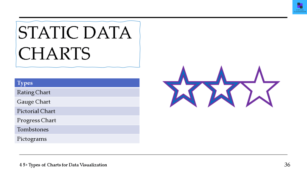
- STATIC DATA CHARTS
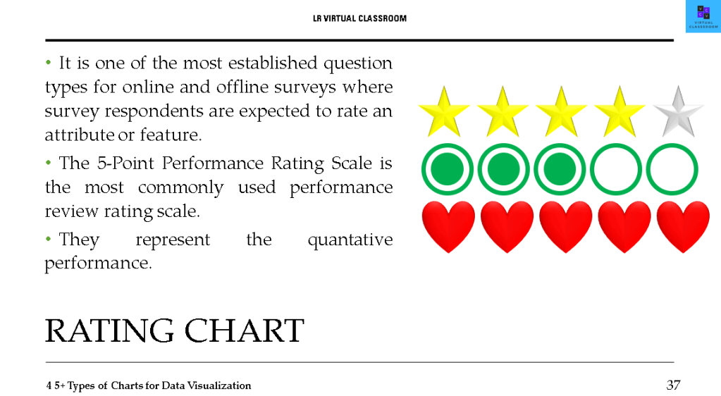
- Rating chart
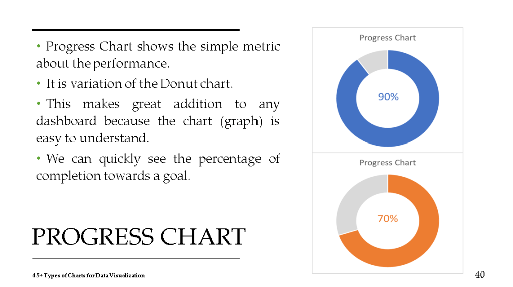
- Progress chart
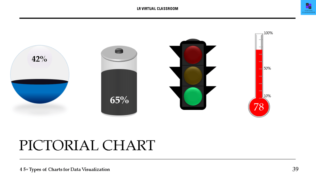
- Pictorial chart
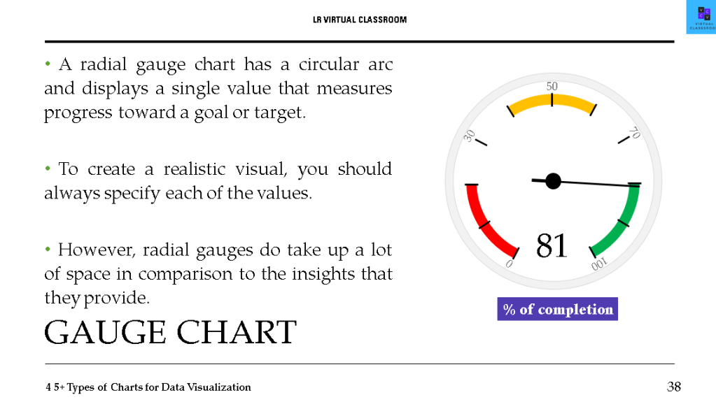
- Gauge chart
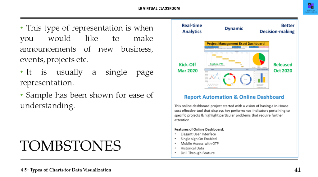
- Tombstones
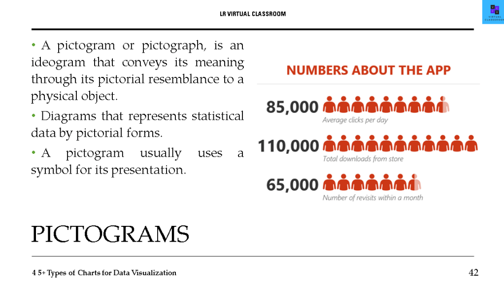
- Pictograms
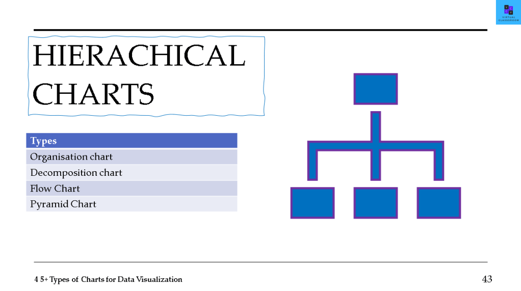
- HIERACHICAL CHARTS
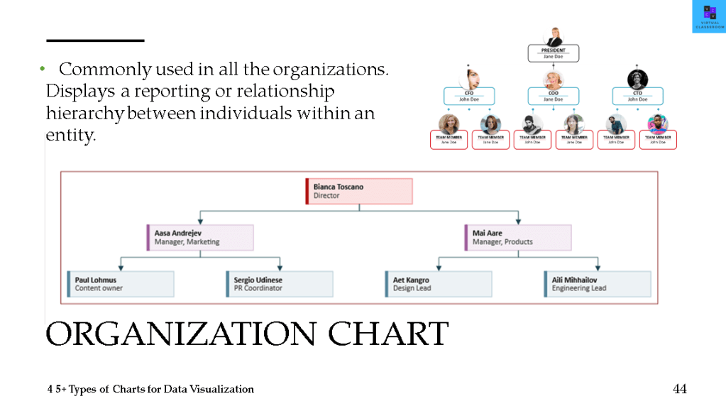
- Organization chart
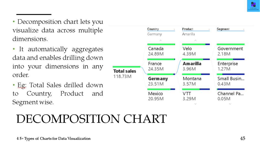
- Decomposition chart
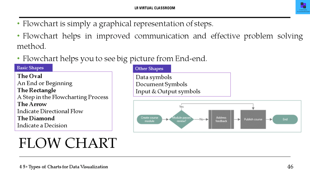
- Flow chart
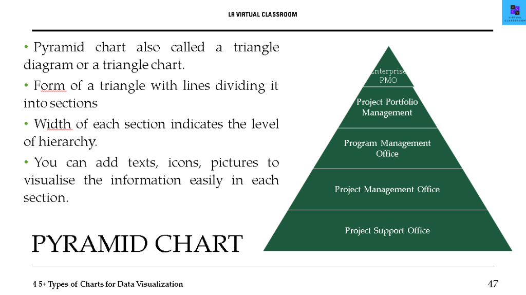
- Pyramid chart
- TIME LINES
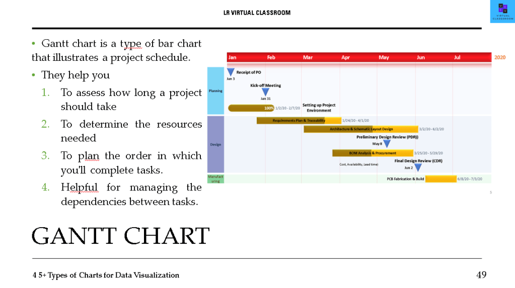
- Gantt chart
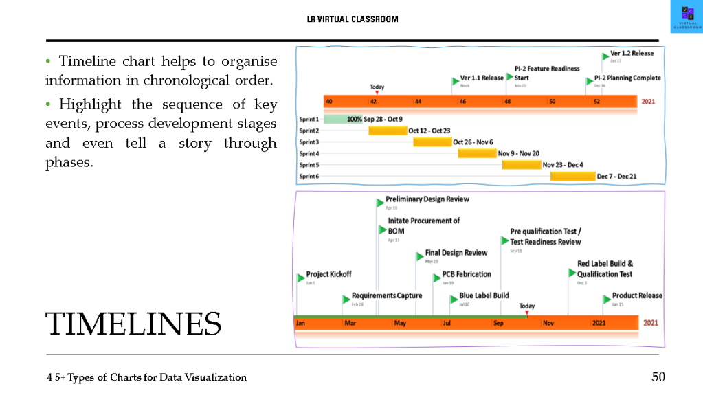
- Timelines
- GEOGRAPHY DATA CHART
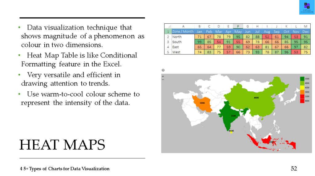
- Heat Maps
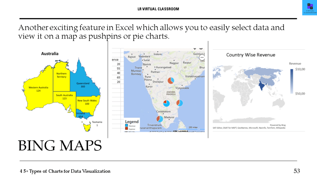
- Bing Maps
- MISCELLENOUS CHARTS
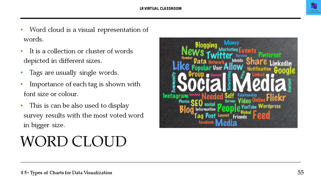
- Word Cloud
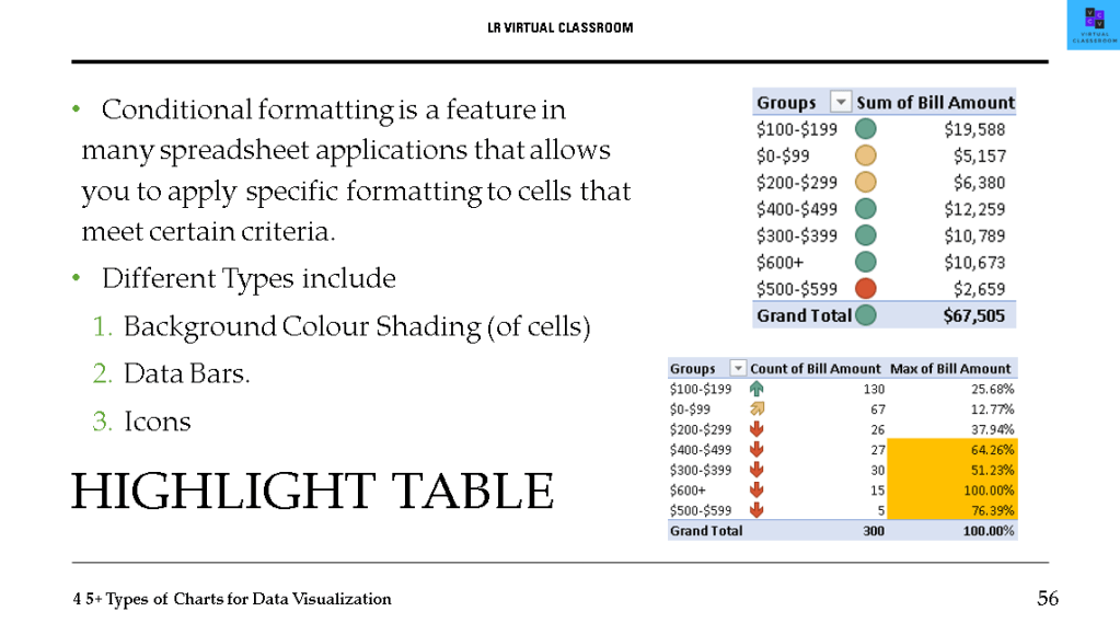
- Highlight table (Conditional formatting)
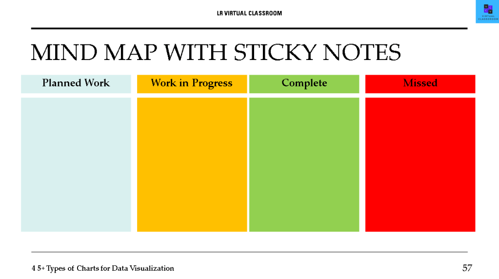
- Mind map with sticky notes
- Control Charts
CHOOSE THE RIGHT KIND
- The type of data, such as integer, categorical, and time-series, will determine the type of visualization you will use.
- If a viewer cannot understand what the visualization is all about within 60 seconds, the visualization is too complex or unclear.
Discover more from LR Virtual Classroom
Subscribe to get the latest posts sent to your email.
