Visualizing and understanding the Jira reports is significant feature to know. Lets see the different types of Jira reporting available. These reports provide details about your projects, issues and performance.
I have used Jira for the inventory management . In the thrust of learning, took time to understand and summarize in layman terms about the various Jira reports based on my experience and learning. This is a good reference post!!
- Burndown Report
- Sprint Reports
- Epic Report
- Velocity Report
- Control Chart
- Release Burndown Report
- Version Report
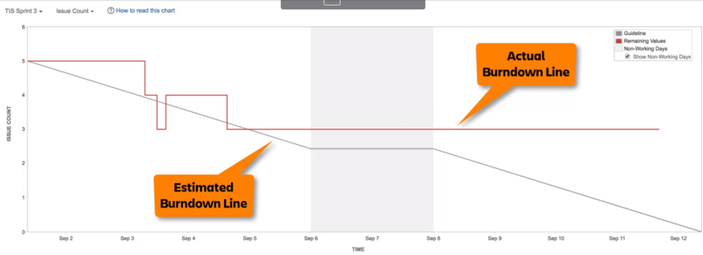
Burndown Report
📉Sprint burn down / 📈Sprint Burn up Chart:
This allows the Agile team to track and monitor the completion of the work along with the sprint. A Sprint Burndown chart is a graphical representation of work remaining versus time. . A Sprint Burn-up chart is a graphical representation of the work completed versus time.
- Shows the diagram of actual and estimated amount of work to be done in a sprint, say a board in Jira.
- Shows the past and present performance enabling the sprint progress. However, it doesn’t show future forecast.
- The estimated burndown is a linear progression from the beginning to end of the sprint. It projects the specific no of issues to be completed.
- The data is calibrated in count of issues/features or story points planned in the sprint . The timeline depicts the sprint days.
- It shows the progress and likely of achieving the sprint goals.
- The vertical grey area is non-working days. You can set up holidays in the Jira based on your project calendar.
| If the estimated line has a sudden spike, | then it means more work is added in the particular day. |
| If the actual line is flat for long period of time and then drops at the end of the Sprint, | then your User Stories may be too big or status updates are irregular. |
| If the actual line is flat for long period of time and then drops at the end of the Sprint, | then your User Stories may be too big or status updates are irregular. |
| If the actual line is flat from mid-time until the end of the sprint, | then sprint is cancelled. |
| If the actual line is very below the estimated line in the very beginning, | then the team is well ahead of the schedule due to UNDERESTIMATION. |
| If the actual line is above the estimated line for a long period of time, | then team needs to add more resources to complete the task. |
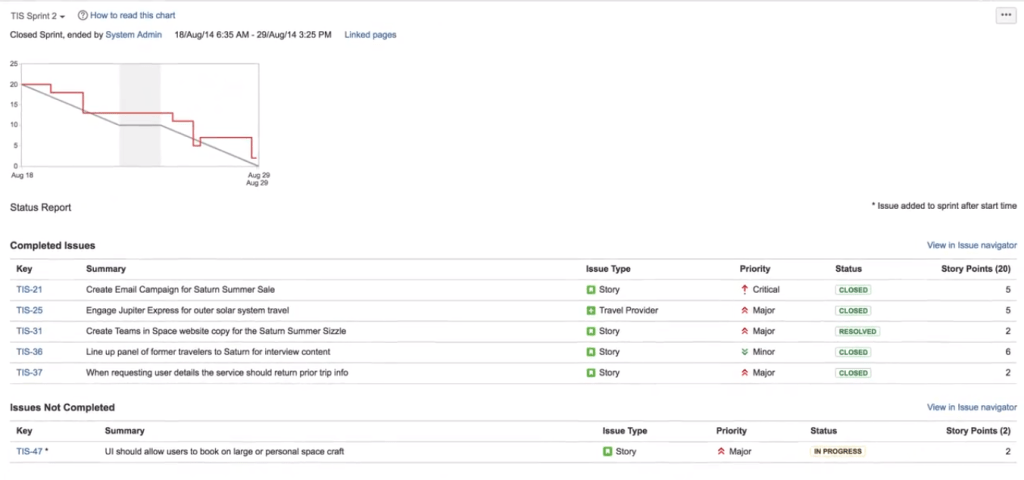
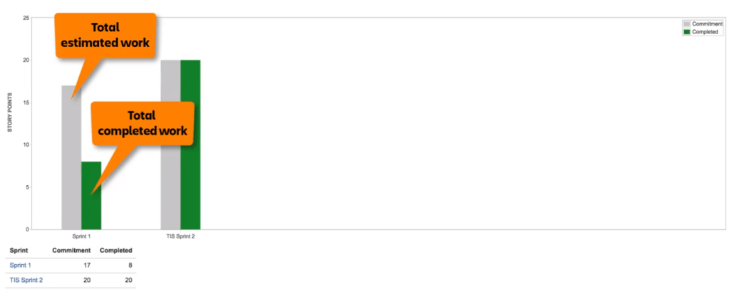
Sprint Report
Next type of report in Jira is the Sprint Report. This report is very useful for the sprint retrospective meetings. This report applies only to Scrum Boards and not to Kanban boards. You can select the report for various sprints. The sprint report shows the various elements like
- Snapshot of the burndown chart
- List of complete and incomplete issues
- Summary of Sprint progress
- Issue fields like Key, Priority, Issue Type & Status is displayed.
- If the issues is added after the sprint, then it is indicated with *
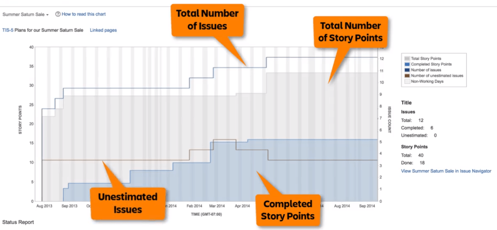
Epic Report
As you are aware of the difference between Epic and Story, Stories are the requirements from the customer and it can be treated as a small project whereas Epic depicts the larger user stories – say Program. For example, Project Dashboard is the Epic and As a user, I want to see the Planned vs Actual Budget is one of the User Story.
Unlike the sprint report, Epic report will show the data for the complete Epic. It has the below information.
- Epic Chart will show the completed, incomplete and non-estimated issues.
- It shows the trending progress.
- It helps in planning across the sprints say Program Increment spanning to several sprints.
- X-Axis shows the time and Y axis has Story points or Issue count.
Velocity Report
Velocity is the average amount of work a scrum team completes during a sprint. Velocity chart is useful in helping to predict how much work can be completed by the team in a future sprint.
- Velocity is calculated by taking the average of the total completed work over the last several sprints.
- Chart plots the team’s velocity over the 7 recent sprints.
- Identify the trends of commitment and & delivery by the team shown in each sprint.
- Useful in Sprint planning meetings to determine the scope. It helps you to commit the work in a sprint.
- It doesn’t show the link of the sprints. However, clicking the sprint in the summary table, shows the Sprint Report.
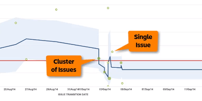
Control Chart
It shows the cycle time of the issues in the sprint. It highlights differences in estimate and delivery time which helps in the future sprint planning.
The control chart can be used to track time by status. It helps to analyzing in progress states where the team is actively working on an issue. It also shows the amount of time an issue spent in each state, making it easy to see where bottlenecks and slowdowns occur.
The chart is plotted with Time in the X-Axis and Days worked in the Y-axis. The solid green circle display the cluster of issues and open green dot shows the single issue.
The position of the dot indicates the date when their status is updated / resolved. It shows how much time it took to transition from one status to another. Don’t forget to filter the control chat to show the “To Do” / “In Progress” issues to analyze further.
The red line represents the overall average cycle time and blue line represents the rolling average cycle time. It considers the issues before and after in the particular day.
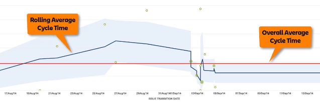
The lower line represent that team is working efficiently considering the cycle time to complete the issues whereas the upper line shows the possible bottleneck in completing the issues.
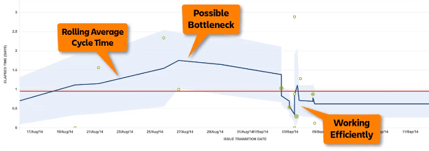
There are various metrics shown in the control chart. They indicate the max, median, average time taken for an issue to transition to different status.

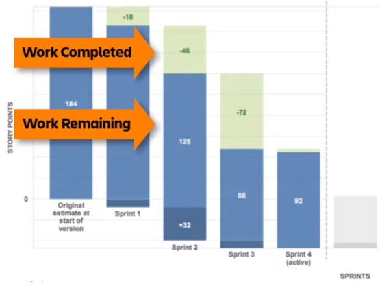
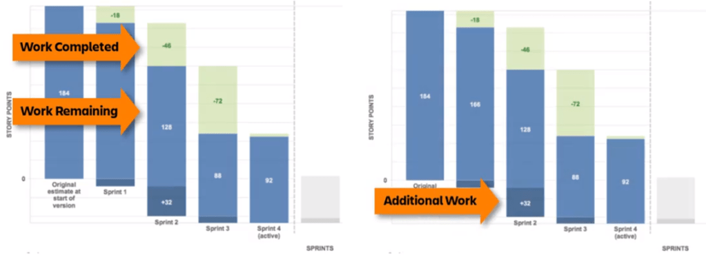
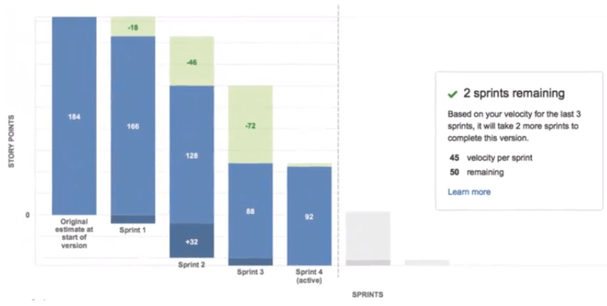
Release Burndown Report
Versions is nothing but denotes the milestone in the project. Each release is called a version. Release burndown chart shows the progress of a release. It shows all the sprints assigned to the specific release.
It shows how additional work has affected a release and also the traceability on how many sprints it took for a particular release/version.
| Light Green | Represents the work completed in a sprint. |
| Light Blue | Represents the work remaining in a sprint. |
| Dark Blue | Represents the additional work added in a sprint. |
| Light Green + Light Blue | Represents the total count of issues planned in a given sprint. |
| Light blue + Dark Blue | Represents the total remaining work at the end of sprint. |
| Grey | Represents the total number of sprints it will take additionally to complete the work based on the velocity. |
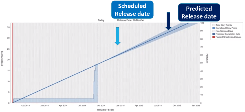
Version Report
Version report shows the progress towards completing a version. It indicates the predicted release date (both the optimistic and pessimistic date) for the version based on the team velocity and estimated amount of work remaining.
Hope you had understood the different types of Jira Reporting.
Discover more from LR Virtual Classroom
Subscribe to get the latest posts sent to your email.

2 thoughts on “Jira Reporting for Beginners”
Comments are closed.